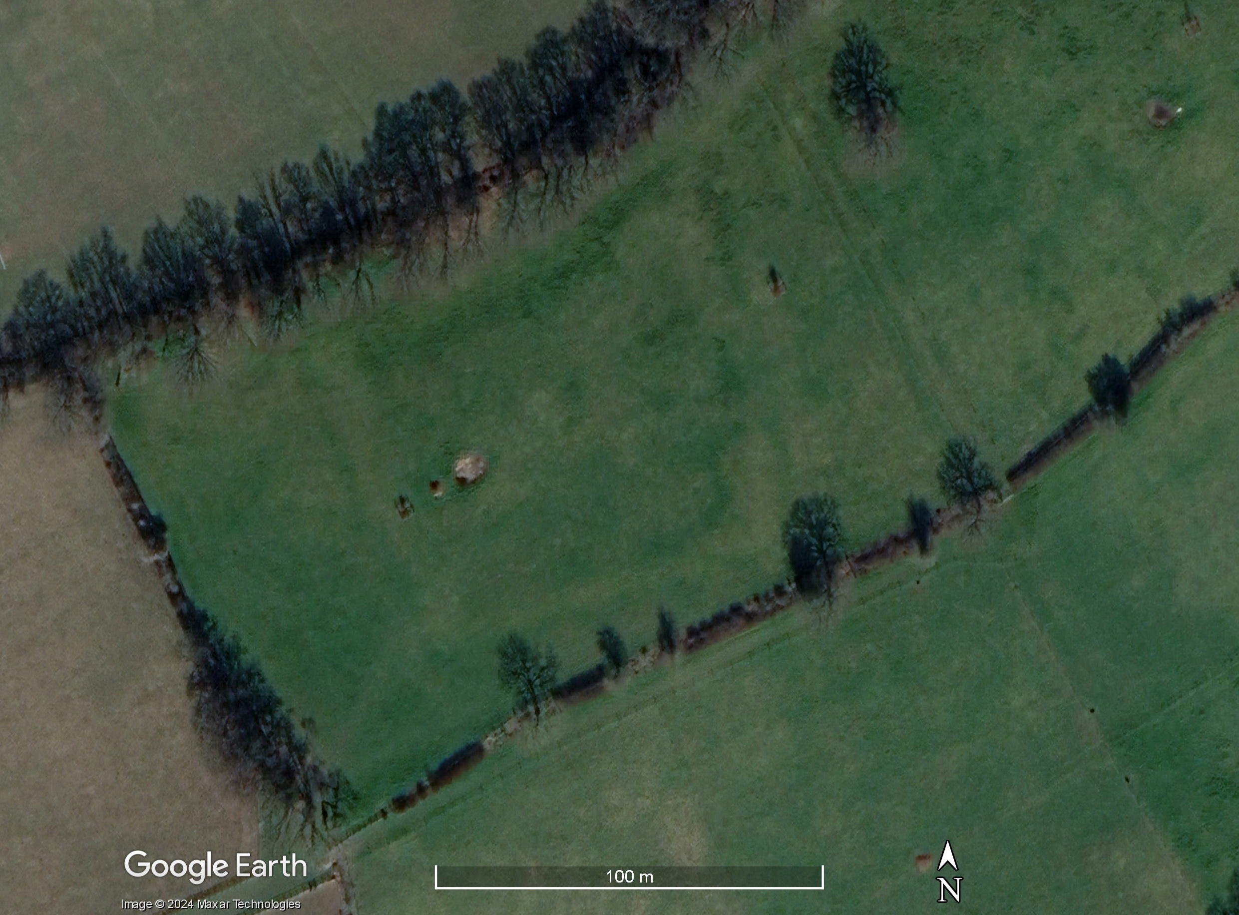
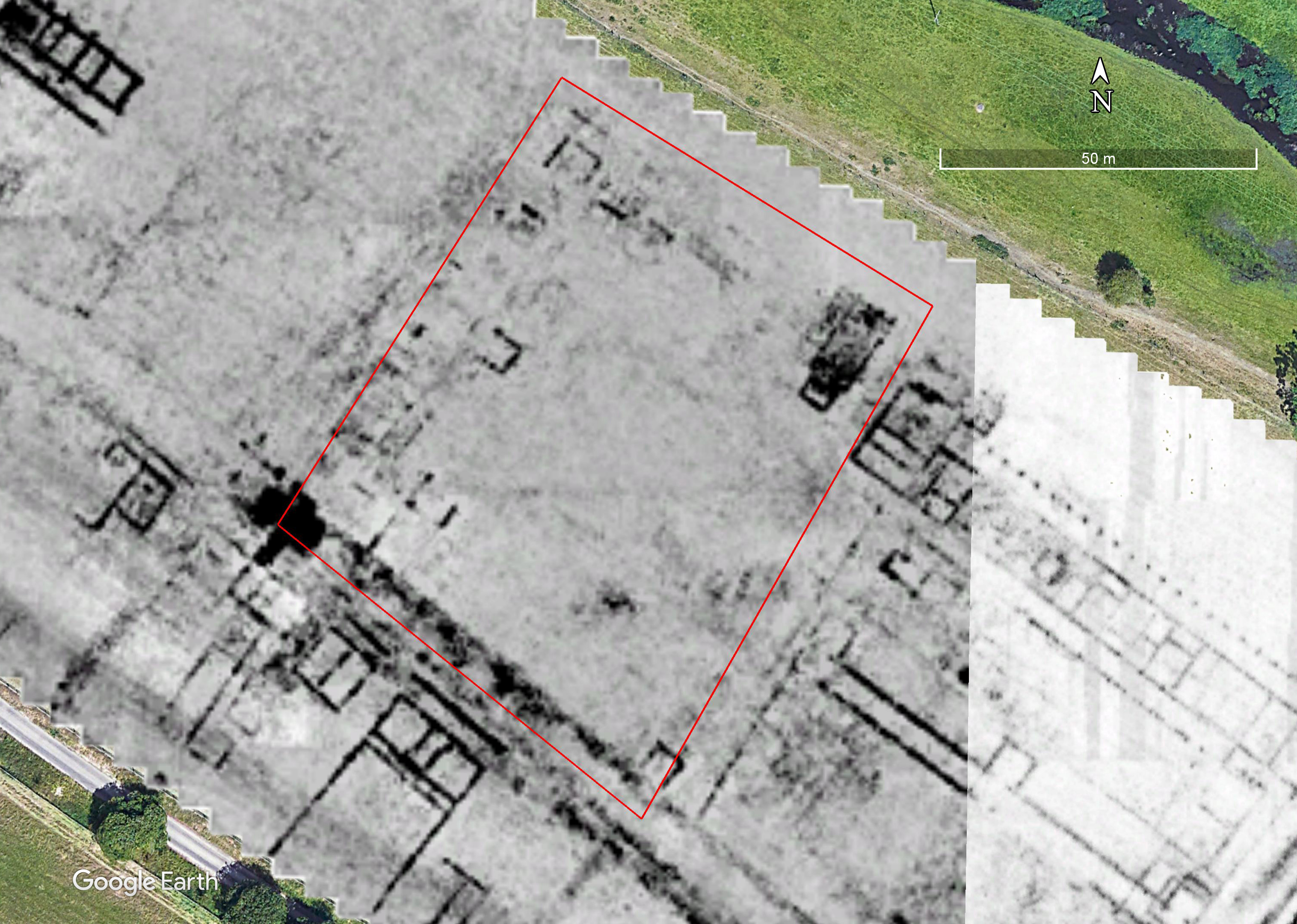
On Sunday 25th February 2024 a small team consisting of members of CAGG and the CVAHS met at Seer Green in Buckinghamshire to explore a site that was seen in the lidar data collected by the Chilterns Conservation Board’s Beacons of the Past project (Fig 1). The lidar indicated quite clearly the presence of a quadrilateral enclosure. On site, the outline of the enclosure could be seen quite clearly through the grass.
Figure 1: local relief model derived from the lidar data of the site. Image derived from lidar collected for the Chilterns Conservation Board to whom thanks are due.
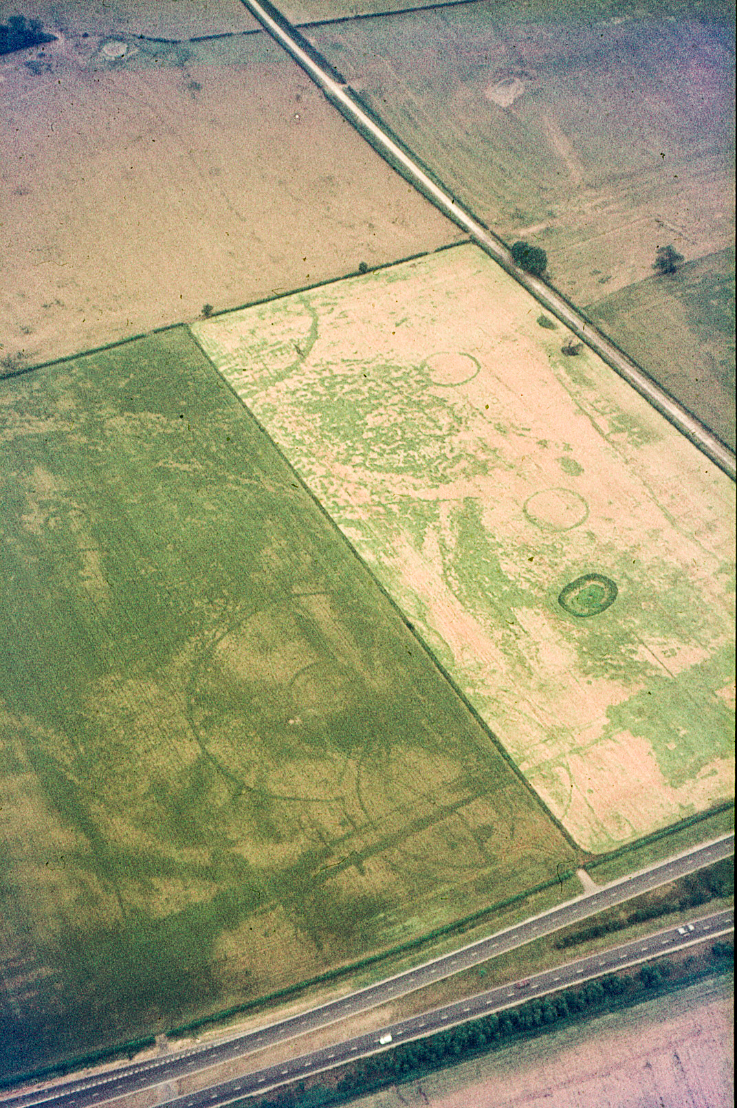
The enclosure can also be seen in the March 2022 imagery available from Google Earth (Fig. 2).
Figure 2: image from Google Earth showing the enclosure.
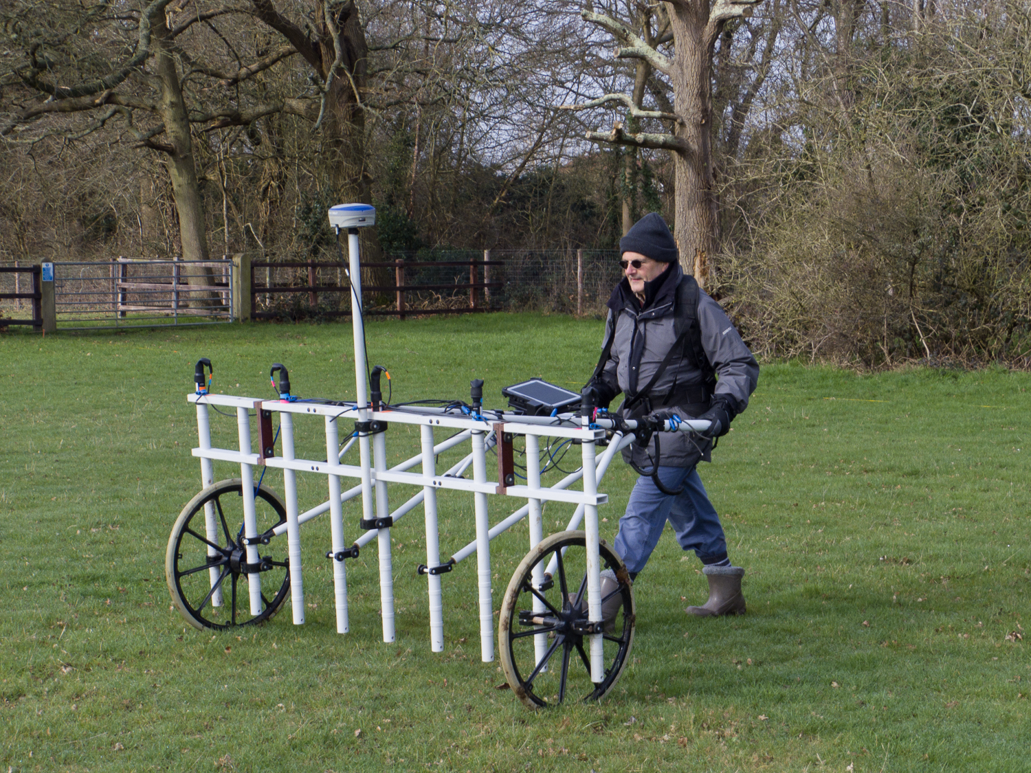
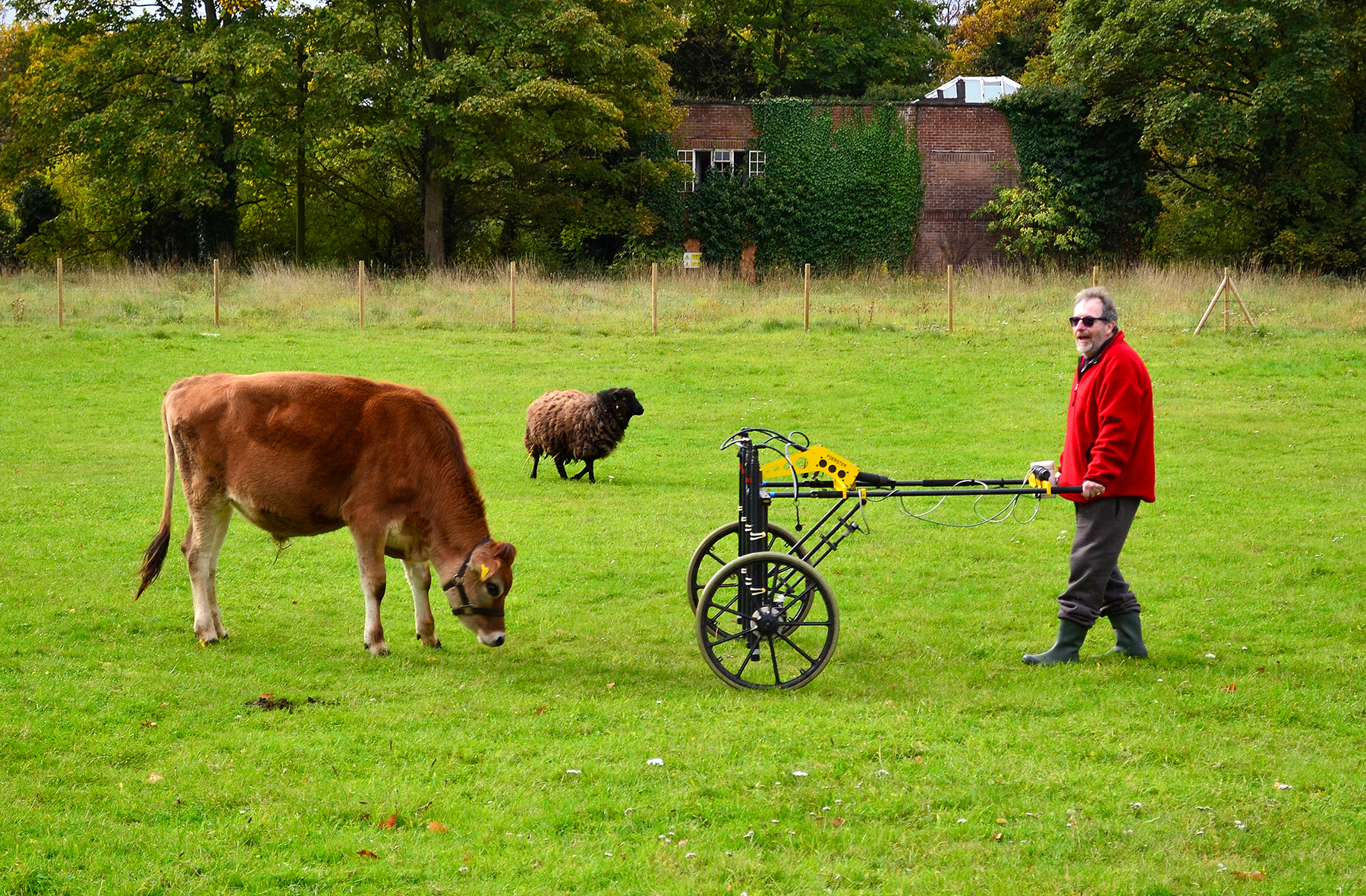
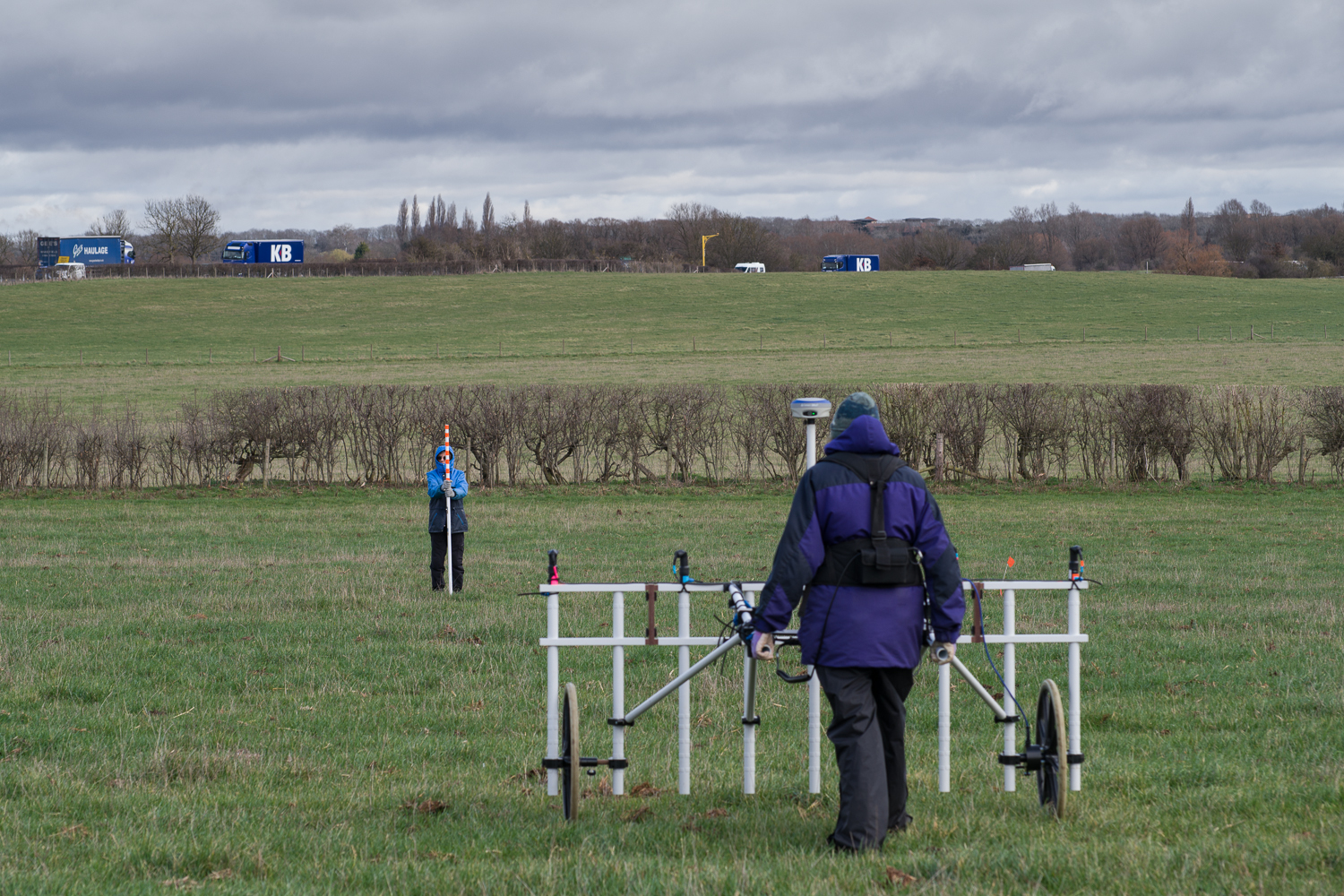
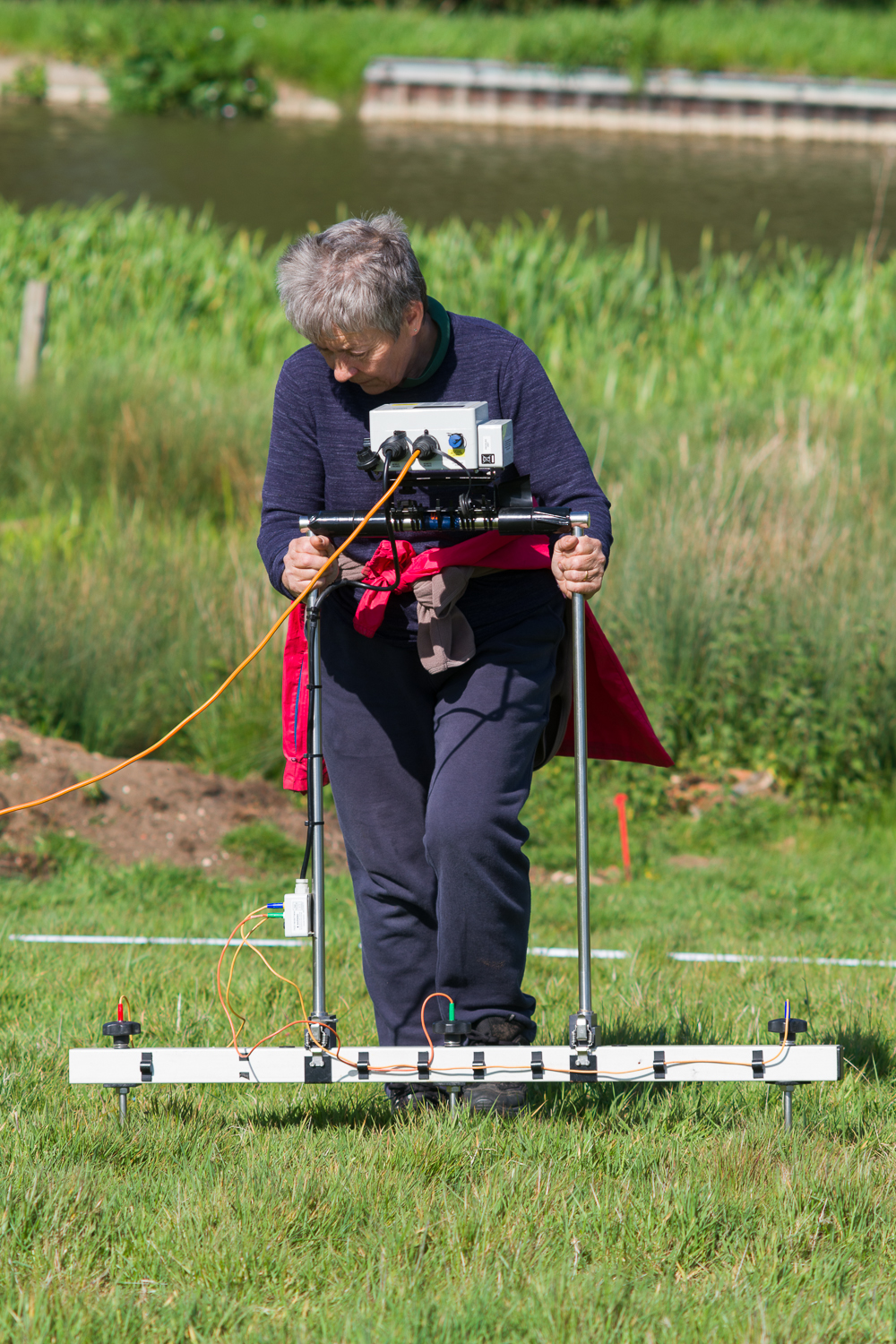
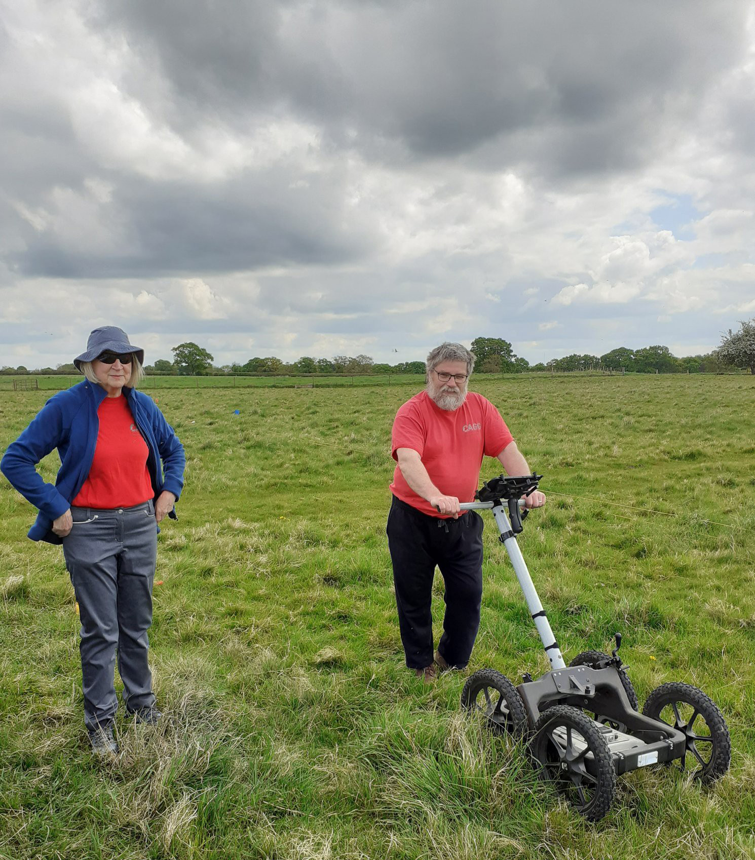
Although it was pretty chilly the ground conditions were good with short grass and not too much mud (Fig. 3) so we were able to complete the whole field in a day, some 2.4ha.
Figure 3: Nigel Rothwell (CVAHS) operates the Sensys magnetometer.
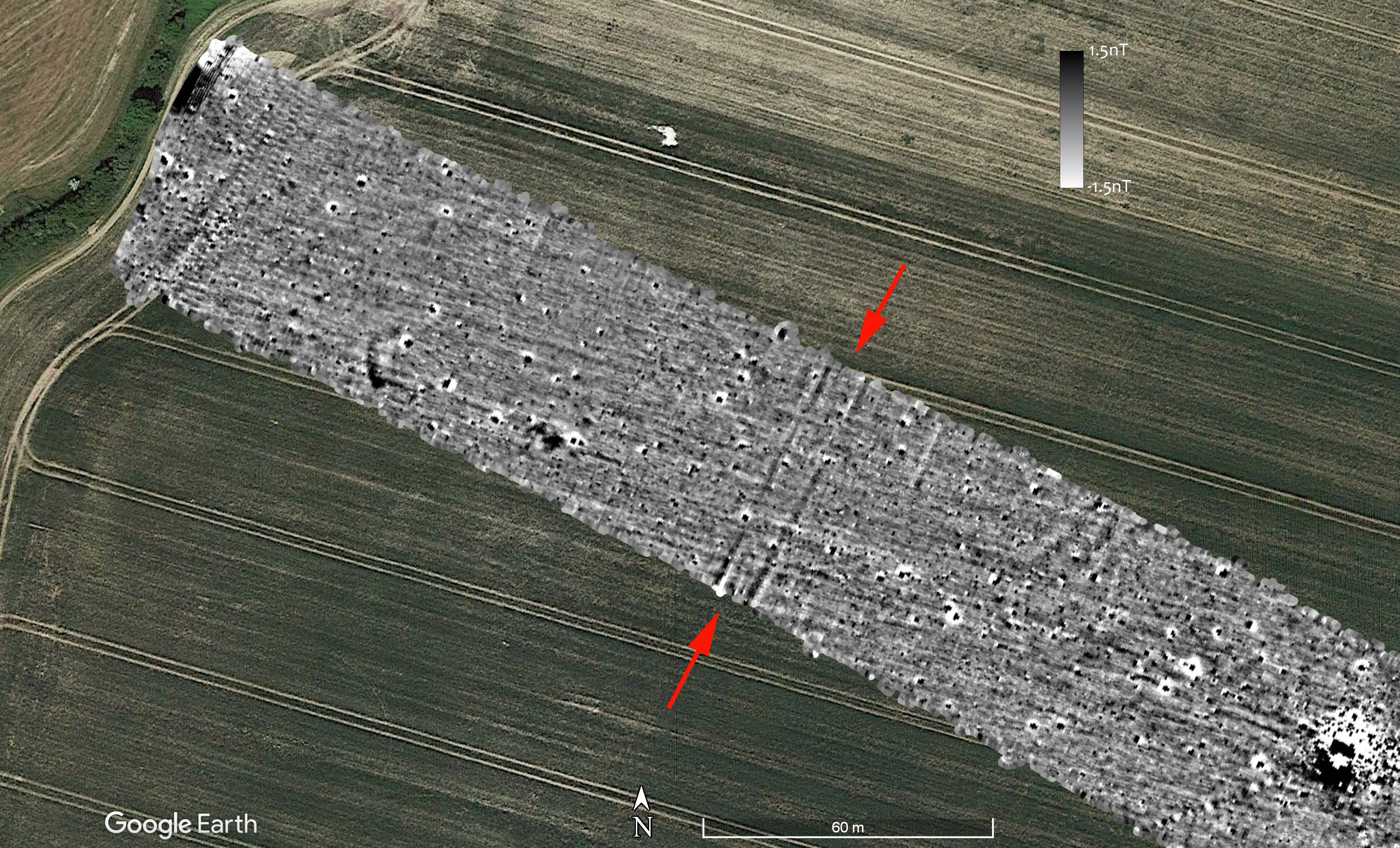
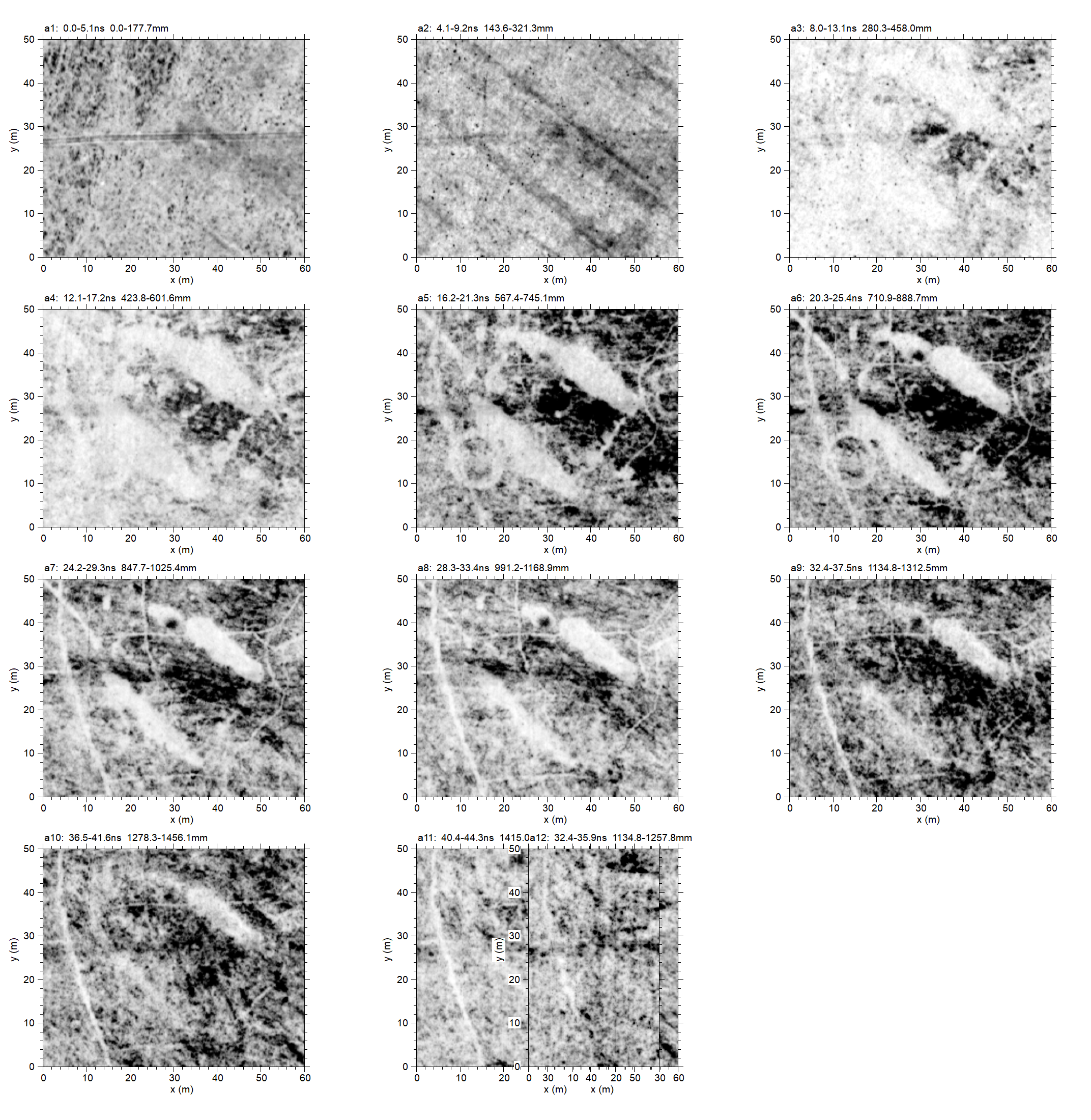
After supper Jim West and I processed the data with high expectations. They were somewhat dashed (Fig. 4).
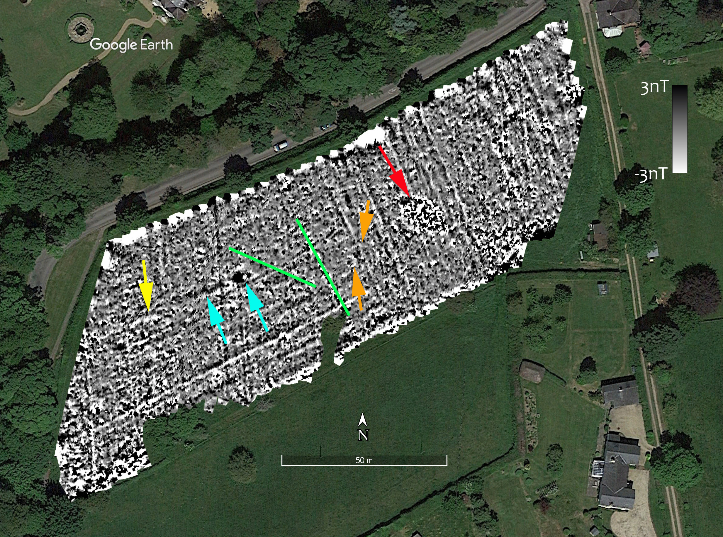
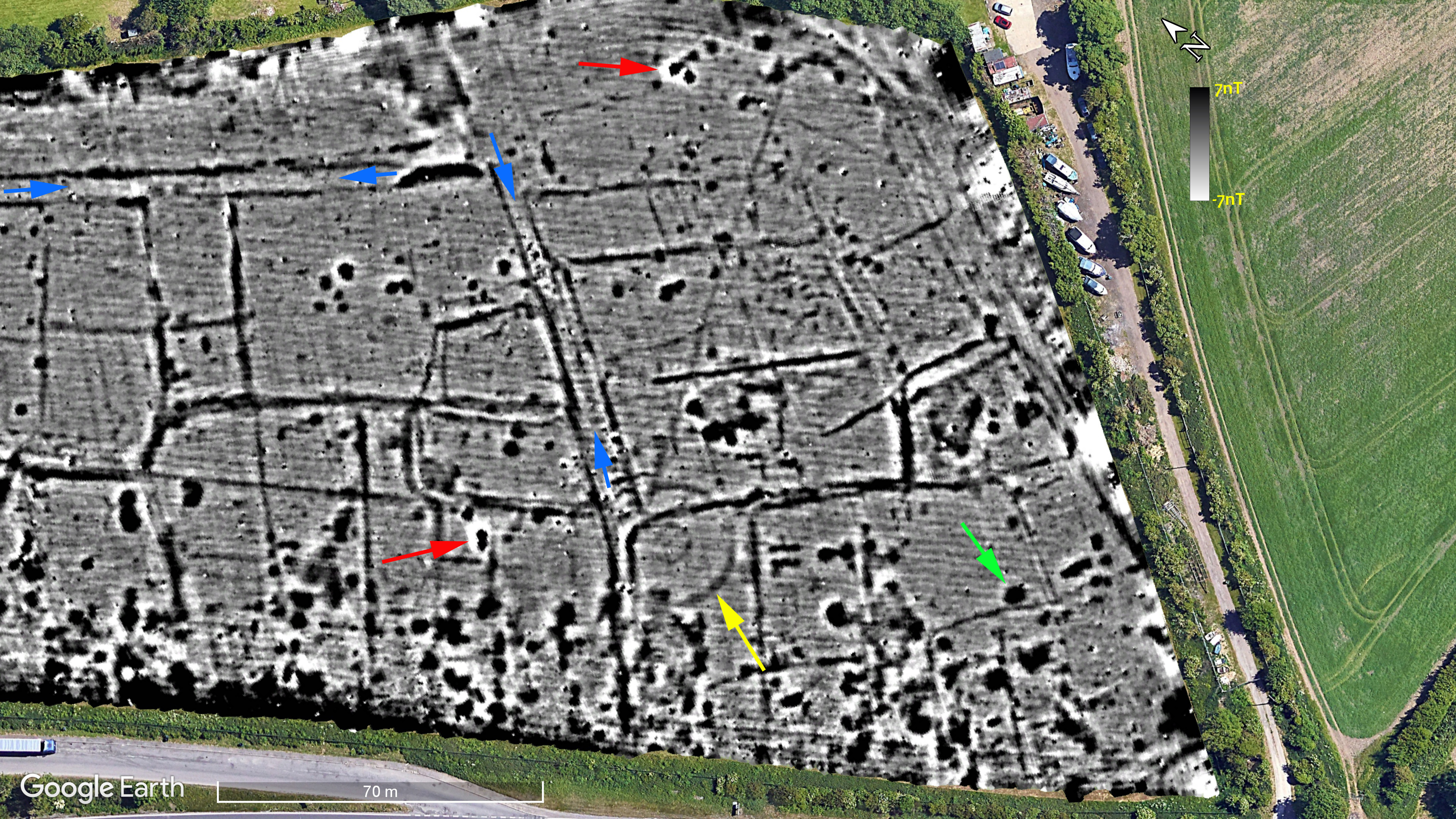
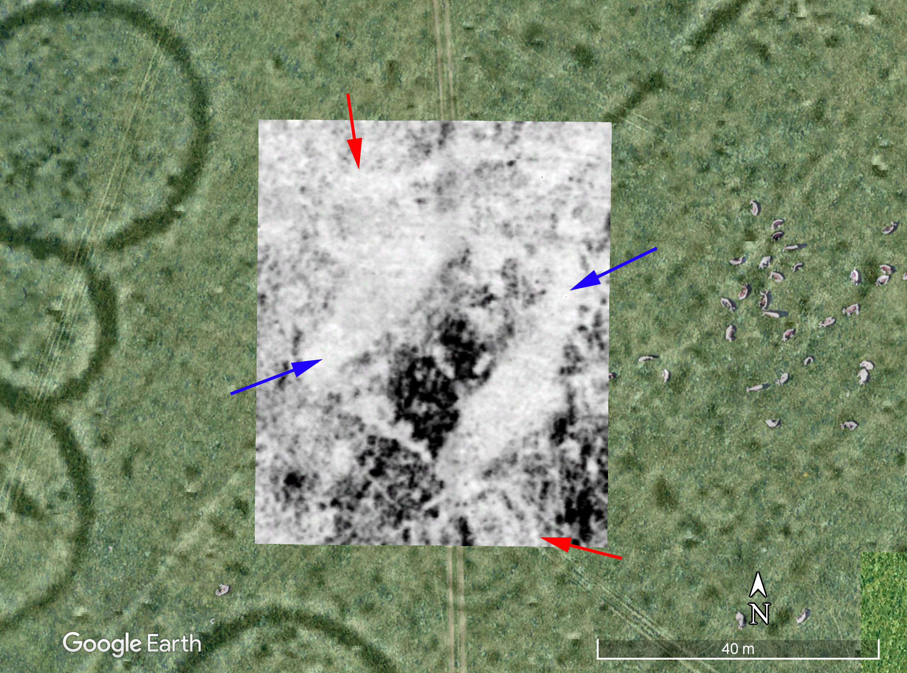
Figure 4: the magnetometry results.
As can be seen from Figure 4, the enclosure does not show in the mag results at all. This is very disappointing. We should keep in mind, however, any geophysical survey technique does not always detect subsurface features: there has to be some contrast in the property being measured. A good example is the colonnaded “palace” building at Verulamium which does not show in the mag at all but shows in the GPR data very clearly.
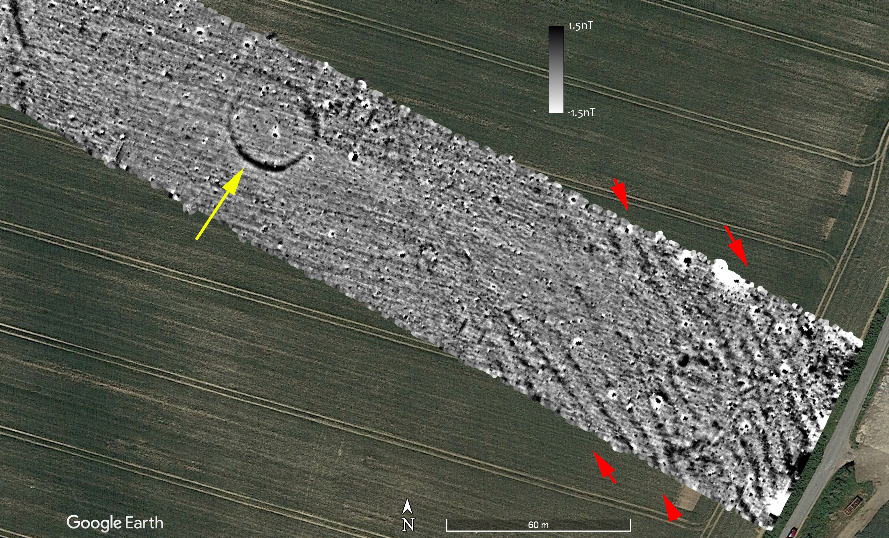
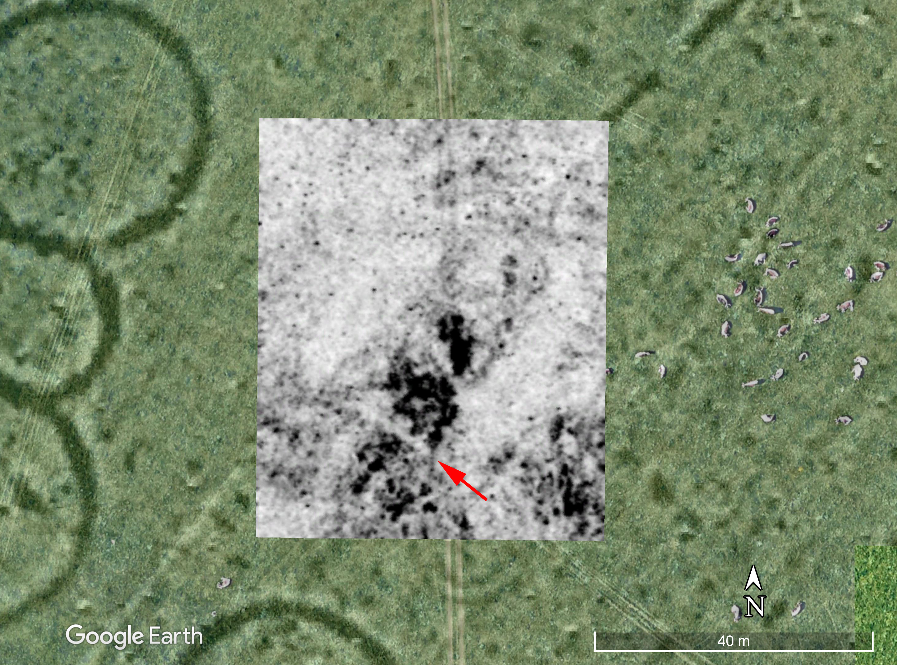
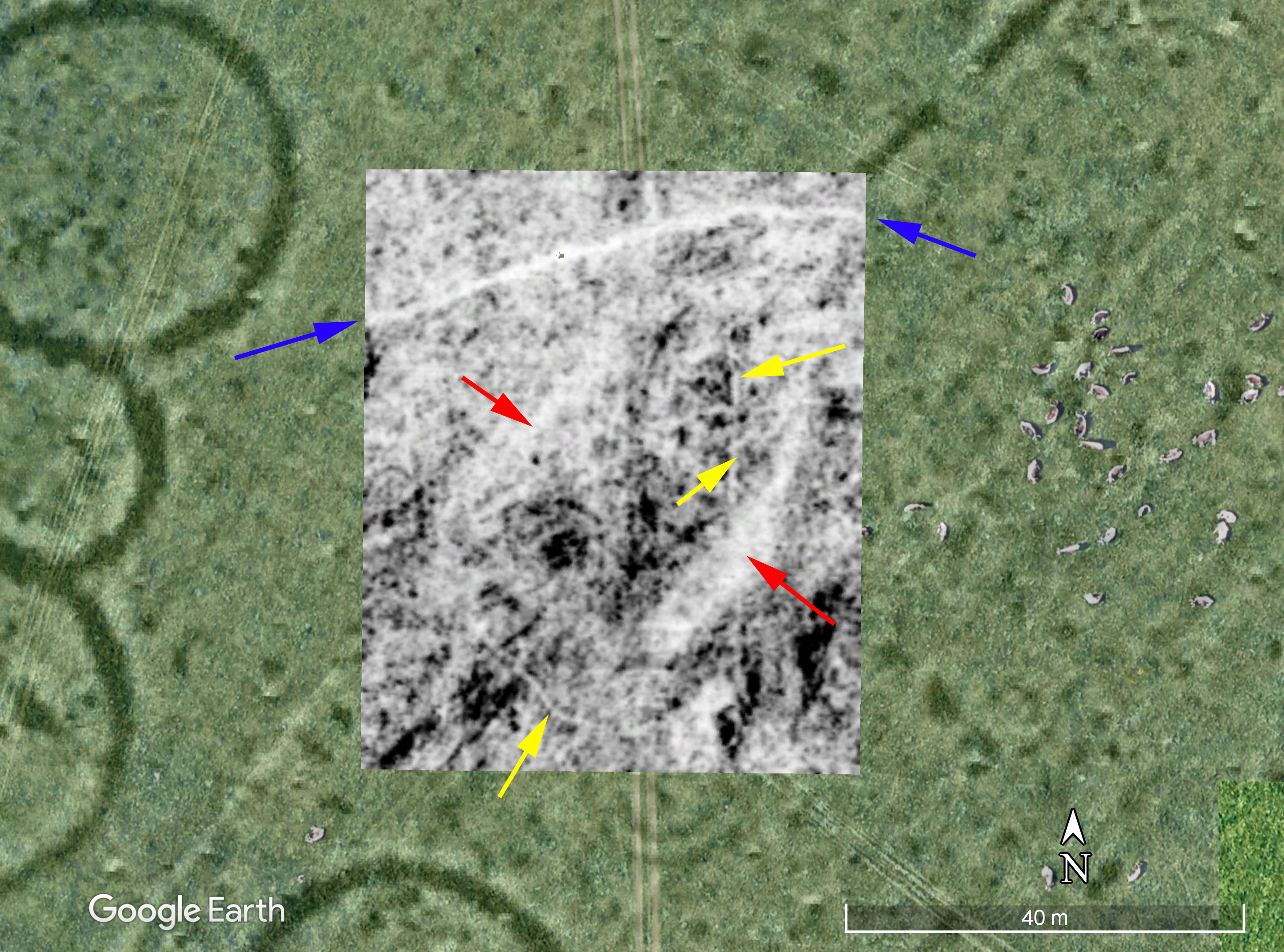
In Figure 5 I have added a crude outline of the “enclosure” created by simply drawing a line around the vegetation marks in the Google Earth image. Although the large “ditch” does not show, there are some features in the mag data. I have indicated one with the red arrow.
Figure 5: the mag survey with the outline of the “enclosure” and one of the possible features indicated.
So although we didn’t detect the enclosure ditch, there are some features in the data. I have indicated just one with a red arrow in Figure 5. This is a roughly rectangular feature about 5m long and 2.5m wide. Just on its southern edge is a smaller “dot” of high readings with a corresponding low magnetic reading. In Figure 6 I have taken a screen shot from TerraSurveyor where I have drawn line across the feature and obtained the readings as a graph (Figure 6).
Figure 6: Screenshot from TerraSurveyor showing the readings across a feature in the survey.
In Figure 6 I have divided the graph into two zones. The rectangular feature has nanotesla values of between -2 and +6. The asymmetrical values are typical of an archaeological feature which is, in part at least, derived from magnetic susceptibility. As a result of the Earth’s magnetic field, features which show because of mag sus will have their main area of negative magnetism to the north. The smaller “dot” feature, however, has a range of c. -6 to +8 nT. Although these are not especially high values. they are more evenly balanced and the area of the negative values is similar to the positive. It is likely, therefore, that the “dot” is a result of something ferrous, although probably something quite small.
There are, therefore, a scatter of probable and possible archaeological features. How could we be sure? Some form of “ground truthing” would be needed. This could be digging a test pit, or could be simply putting a small auger into the features and around them.
Why the large ditch (if that is what it is) does not show is more problematic. The fill of the ditch is not more magnetic than the surrounding soils. Perhaps the bank was deliberately backfilled into the ditch and thus mainly putting the subsoil back into the hole it came from? This is just a guess. We should also note that the site was wooded from the mid-16th to the mid-19th centuries. The removal of mature trees may have had an impact. The geology here is Beaconsfield gravels. These are described by the British Geological Society as comprising “1 – 7 m of variably sandy and clayey gravel”. Perhaps these gravels are not good for magnetometry? I would have liked to take some mag sus readings at the site as we have elsewhere. I’m slowly building-up a databank of readings which, eventually, I can compare to the geology and the “success” of the mag surveys. What I do know is that we seem to have rather poor results for surveys we have undertaken for CVAHS!
The survey was undertaken by Jim West, Janet Rothwell, Nigel Rothwell and Kris Lockyear. The equipment was provided by the Institute of Archaeology, UCL. Many thanks to the landowner, Sir Andrew Witty and and to Julian Faircloth who facilitated our access.
Earlier in the year (16th/17th of February 2023 to be exact), members of CAGG along with students from UCL and staff from the Herts Historic Environment Record teamed-up to survey a transect across a field near Bygrave in the north of the county. The field had been surveyed before, and we were asked to look at a small section of it by the HHER for comparative purposes. I have written a detailed report which is available from the Hertfordshire planning portal and from my academia.edu pages.
The mag survey consisted of a transect across the field roughly 50m wide and 600m long. We were able to complete this within the two days using our new Sensys machine. I had plotted the centre point of the probable Bronze Age barrow and got the team to aim their transect to cut across it, which they did very nicely (Figure 1)!
Figure 1: Julia Rogers (UCL) operating the Sensys magnetometer assisted by Greer Dewdney (HHER). Photo: Daniel Phillips.
Figure 2 shows the results from the mag survey. Due to the long length of the transect I’ve split it into three parts in Figures 3, 5 and 6.
Figure 2: the whole magnetic survey transect.Figure 3: the western end of the magnetometry transect.
In Figure 3 we can see two parallel lines running roughly north-south indicated with the red arrows. These were seen in the earlier survey and also in some of the Google Earth imagery. The most likely explanation is they indicate the line of the Roman road. In order to test if there might be buildings either side of the road we did a limited Earth Resistance survey (Fig. 4).
Figure 4: the Earth Resistance survey overlain on the magnetometry survey.
In Figure 4 I have overlain the Earth Resistance survey on the magnetometry. The left-hand image is from the survey with a 0.5m mobile probe separation. That survey is “looking” roughly 50cm below the surface. The two ditches show very well, and higher resistance readings between the ditches at the north end suggest some of the road make-up may survive. The readings decrease to the south and the ditches become less clear. This is probably because we are moving downslope and there is an increase in the depth of colluvium. The 1m probe spacing data on the right is less clear and more dominated by roughly east-west stripes. These are following the cultivation lines. I speculate that these are connected to cultivation, maybe deep ploughing?
Figure 5: the centre section of the mag survey.
The centre of the survey is less interesting (Fig. 5). The messy black and white blob in the middle is a modern ferrous feature. In some earlier Google Earth images the ploughing goes around it. There are two pipes going towards it (indicated by the blue arrows). The magnetic contrast in this field is very low. I have clipped the image to +/- 1.5nT. For comparison, the Verulamium surveys are often clipped to between +/-6nT and +/-9nT. The very slight “ripple” look in the block indicated by the yellow arrow is due to the operator having something ferrous on them at the time (car keys, wallet, phone in a pocket for example?). Although the cart is much more tolerant of the operator having something magnetic on them (after all, we have a giant battery on our backs!), it is not immune especially when we have to clip the data quite harshly as here.
Figure 6: the eastern end of the mag survey.
At the eastern end the main feature is the ploughed out round barrow indicated by the yellow arrow. The upslope part is less clear probably because it was under a later field boundary that can be seen on the historic maps. The striping seen at the far end indicted by the red arrows are erosion channels in the relatively steep slope here. Just outside the survey area were a series of sand and gravels quarries shown on the historic OS maps.
Figure 7: the Earth Resistance survey over the barrow.
On the second day we had just enough time to survey a single 20x20m Earth Resistance block over the barrow (Figure 7). Unfortunately, my plotting was a little too accurate and the survey was almost exactly inside the line of the barrow! It would be lovely to redo this at some point.
Figure 8: the mag sus survey underway. Kris Lockyear is using the Bartington mag sus meter, Andy Instone (HHER) is recording the location with the GPR and Sarah Talks (CAGG/Ashwell Museum) is using the Mark 1 data logger. Photo: Daniel Phillips.
We were able to take some magnetic susceptibility readings on the second day (Fig. 8). The aim over the long term is to take some readings at the site of most of our mag surveys so we can build-up a data base of values compared to the “success” of the mag surveys as well as contributing to being able to interpret the wider geophysical surveys. Figure 9 shows the results.
Figure 9: the magsus survey.
The mag sus survey shows quite low contrast in readings going from 20 to 50 si units. The higher readings, however, do show the presence of the old field boundary which can be seen in the historic maps and the local relief model derived from the lidar data (Figure 10). The slight surviving bank from the field boundary was not at all obvious when walking around the field.
Figure 10: Local relief model derived from the 1m lidar data using QGIS. Hill-shading is from the SW. Red line: the magnetometer survey area. Red arrows: removed hedge line showing as a slight bank; blue arrows: linear depression; green arrow: small mound at the location of the ferrous magnetic feature. Data is used under the Open Government licence v.3.0. (Data downloaded from https://environment.data.gov.uk/DefraDataDownload/ ?Mode=survey on 2023-04-14.)
For more details on this survey, please consult the report linked above. One of the great things about working with CAGG is how it brings together quite mixed groups, in this case members of CAGG, students from UCL and the staff of the Herts HER. Many thanks go to Daniel Phillips for suggesting this survey and helping organise it. The team consisted of: Ruth Halliwell (CAGG), Jim West (CAGG), Graham Spurway (CAGG), Pauline Hey (CAGG), Sarah Talks (CAGG), Daniel Phillips (HHER), Andy Instone (HHER), Rebekah Hart (HHER), Greer Dewdney (HHER), Julia Rogers (UCL), Fiona Yuen Lam Laii (UCL) and Charlotte Trudinger Charnley (UCL). We would also like to thank PACE Jolt Energy Ltd, for facilitating access to the land.
On Sunday 26/11/2023 a small team of four of us surveyed Frith Hill near Great Missenden for the Chess Valley Archaeological and Historical Society (Figure 1). We were just doing magnetometry with the hope of locating the eastern side of a “camp” which can be seen labelled on the map (Figure 2). The day started out cold and frosty but descended into light drizzle. Lovely! With our new mag, however, we completed the majority of the field by about 2pm, an area of just under a hectare.
Figure 1: Rhian operating the mag.
The 1874-1877 six inch OS map shows the windmill that existed on the edge of the site (BHER No. 0220400000), and the fact that the field was used as “gardens” at that time, by which they mean commercial gardens rather than ornamental ones (Figure 2).
Figure 2: The site (outlined in red) on the 1874-7 six inch OS map (from the National Library of Scotland, CC-BY). The hashed line represent “gardens”.
The geology of the site is clay with flints over chalk. As is often the case in our area, the clay is on top of the hills, and therefore so are the puddles! The camp is thought by Daniel Secker to be a medieval ringwork. There is a plan and discussion published in Records of Bucks for 1998.
Using the 1m Govt Open Access lidar data, I have created a simple relief model (SRM) of the area. The SRM “flattens out” the landscape and shows small variations against that flat background. It is ideal for showing small scale “lumps and bumps” such as the old field boundaries at Gorhambury. The initial output from a SRM is a bit flat visually, and so some form of hillshading (i.e., applying a virtual raking light) is needed. I have used a “multiview” hill shade. The results are shown in Figure 3.
Figure 3: Lidar data processed using a simple relief model and multiview hillshade. Original data from DEFRA, Govt Open Access licence v. 3.
As can be seen from the lidar, the field has lots of linear features across it running roughly N-S, and slightly downhill. Are these be the remains of the “garden” shown on the OS map? There is also a shallow depression in the field which looks a bit like an inverted pimple. We could see this clearly as we were surveying.
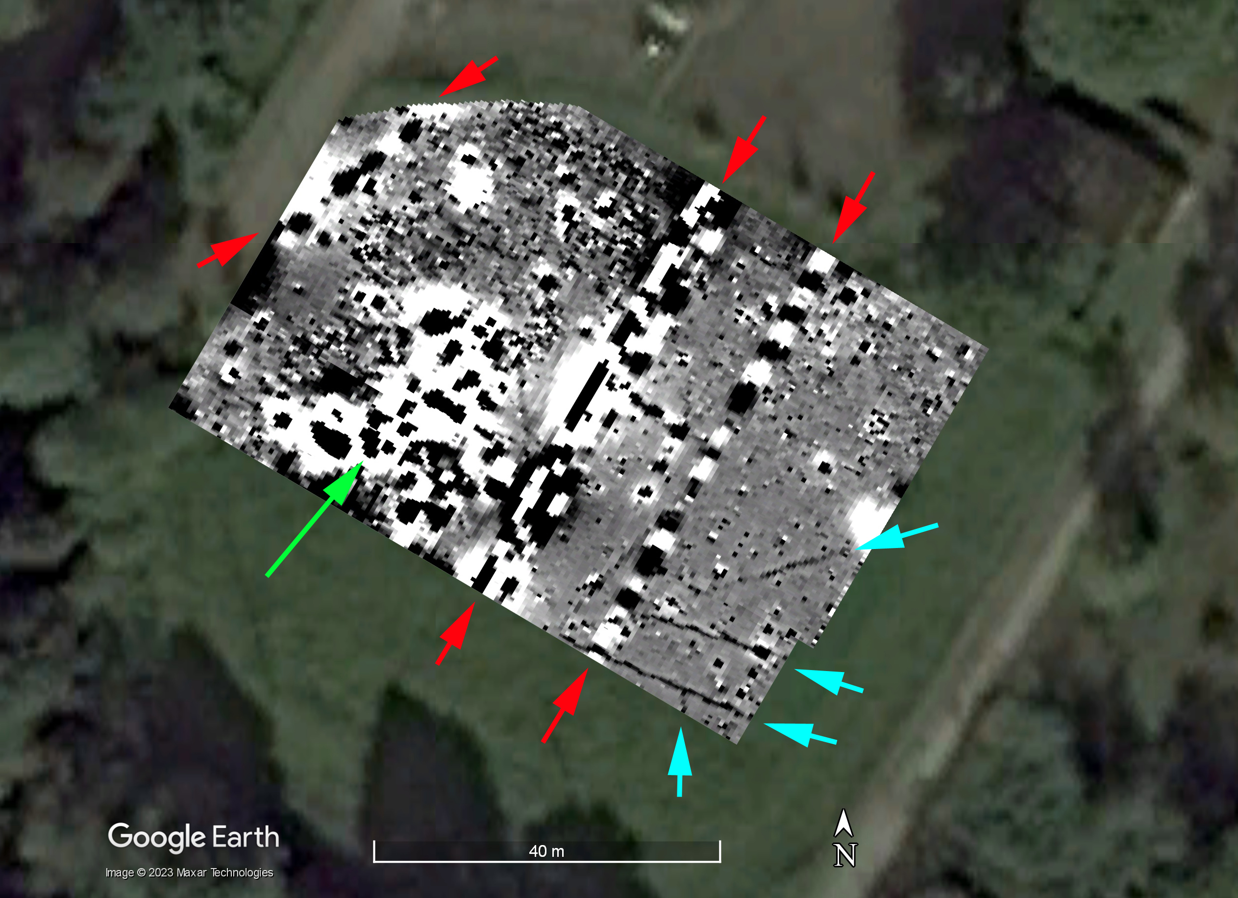
Figure 4 shows the processed mag results.
Figure 4: the magnetometry survey results.
As can be seen from the plot, the linear features seen in the lidar plots dominate the results. There is also a long linear feature running parallel to the southern fence which might be a drainage ditch.
There are some more subtle things in this field, and I have labelled them in Figure 5.
Figure 5: annotated mag survey results.
The red arrow in Figure 5 points to a concentration of ferrous noise. This is in the dip mentioned above. As this is not where the windmill was situated it must have another origin. I wonder if it is a clay pit which has been filled with rubbish? The two green lines overlay two very faint linear features which might be old and highly decayed services. There are a couple of poorly defined positive features marked with the blue arrows which might be a pit and a short length of ditch. The yellow arrow marks an area of low magnetism in an arc. I’m not sure what this might be. Finally, I’m probably grasping at straws, but are there two circles indicated by the orange arrows?
Sadly, given the proximity of the “camp” at the western edge of the site, the survey has been very inconclusive. As always with geophysics, the absence of evidence is not evidence of absence. It might be worth trying Earth resistance survey or GPR?
Many thanks to the team of Jim, Rhian and Mike, and especially to the land owner for allowing us to access his land for the survey.
This post goes back into the deep prehistory of CAGG. Way back in 2015 we were contacted by the Eighth in the East project to see if we would be interested in doing some geophysics as part of one of their research days. The project, funded by the National Lottery Heritage Fund (as it is now called) ran from 2013 to 2016. In their own words:
It aimed to promote and record the built and social legacy of the 8th United States Army Air Force during their time here in the East of England in World War II.
As is usually the case with lottery-funded projects, their website is now dead as the funding ran out to maintain it. We did two days of survey in late October 2015 in a small field on the edge of the site, completing both magnetometry survey and GPR survey. There was then an open day on the Sunday which we attended with some posters and a display of the equipment. The reason for the survey was because the Bushey Hall had been an 8th US Army Air Force base. Although the more temporary buildings survive (and are now used by the Forties Experience, Fig. 1) the main building had been demolished in the 1950s. Our survey was aimed at finding out if anything remained of the Hall.
Figure 1: One of the standing buildings on the site. Photo (c) Mike Smith.
You may ask why I am writing the blog almost eight years later? in 2015 the dGPS was a new toy and I was only just getting used to it (Fig. 2). Because the area we wanted to survey was small and at 45 degrees to the National Grid, I decided to use a “floating grid”. As wonderful as Leica dGPS units are, their manuals suck. I didn’t realise that to get the OS coordinates of points I laid in on my floating grid, I had to actually take a measurement at each point. Since Bushey, I have always taken a reading at each grid point and then worked out the maths to calculate the corners of the image of the survey which may be outside the area we have surveyed. I now end-up with three sets of coordinates for each corner: the floating grid, the OS coordinates (either measured or calculated) and then the lat/long coordinates for placing the image on Google Earth given by the OS’s website. For Bushey Hall I only had the floating coordinates and so could not place the survey in the correct place.
Figure 2: Fighting with the GPS.
Slow-forward to yesterday. I finally gritted my teeth and motorcycled into Watford and went to Bushey Hall. Watford seems especially bad at road signs and as I don’t have a GPS for my motorcycle finding anything is a pain. After my magical mystery tour of Watford I found the site which has changed a great deal since we surveyed it. I then stood there trying to find the correct floating grid definition file. I was just about to give-up when in desperation I used one called “blaah”. Yay, it was the right one. I guess the name accurately sums-up how I felt about the process at the time. I wandered around the field locating old survey points and taking GPS readings. I also plotted a further five points just to be sure.
When I got home I downloaded the data in both floating grid point coordinates and OS coordinates. In Excel I edited the files so that both sets of coordinates for each point were on the same line. These were imported into the statistical program R where I ran a regression on the floating coordinates against the OS ones. They should be a perfect match (for stats nerds, r2 should be 1). Yay again, it worked. Having worked out the corners of the images from the two surveys in floating-grid coordinates, I can use the predict function in R to give me the OS coordinates. Having got those, I put them into a simple text file and uploaded them to the Ordnance Survey which converts them to lat/long and I can download a .csv file of the results. These I can then cut-and-paste into Google Earth to get the images in the right place. This stage always has me holding my breath… have I got everything right? Yay x 3. After eight years I finally have the images in the right place and can write this blog. Phew.
The mag survey was fiddly to complete as there were various obstructions in the way and a small area which involved some wheel spinning (Figs. 3 and 4).
Figure 3: Peter pushing the Foerster mag at Bushey Hall. Image (c) Mike Smith.Figure 4: survey problems! Image (c) Mike Smith.
Given this was a historic site, and that there were lots of modern things in the way, we expected the results to be full of strong magnetic features. We weren’t wrong (Fig. 5).
Figure 5: magnetometry results overlaid on the Google Earth image from October 2015.
The red arrows in Figure 5 are the classic signature of ferrous services such as old waterpipes. There are four running across the site (the middle one looks like two side-by-side) as well as a funny L-shaped branch in the middle (perhaps to supply water to a standpipe or a fountain in the Hall’s gardens?). The blue arrows indicate smaller linear features. Given that this area is in the garden of the Hall, I suspect these are land drains. The mass of strong readings on the western side shown with the green arrow are typical of a historic site. Maybe this was the hall itself?
The GPR survey (Fig. 6) was very successful even if we had some issues during data collection (Fig. 7). The top slice (Fig. 8) shows two ovals, a very strong outer one and a fainter inner one.
Figure 6: the GPR survey in action.Figure 7: Pick-up duties!Figure 8: GPR time slice 1 (0.0–5.7ns).
The outer band of strong reflections (shown in red) are some sort of track. Even yesterday (25/08/2023) I could see parts of the concrete curb stones poking through the grass. The Google Earth image from September 1999 shows the two tracks quite clearly (Fig. 9) but zooming in (Fig. 10) doesn’t really give a clue what they were for. Probably some form of sport? The inner one looks quite ephemeral unlike the outer which I think was tarmac or cinder with concrete curb stones. It is quite impressive that something as ephemeral as the inner track survives well enough to be seen in the GPR data.
Figure 9: Google Earth image from September 1999.Figure 9: Detailed view from Google Earth for September 1999.
In Slice 3 (Fig. 11) some of the services that can be seen in Figure 4 can start to be seen, especially the land drains.
Figure 11: Time slice 3 (8.0-13.7ns).
Time slices 4 onwards start to show the building foundations very clearly. Yes! We had found the remains of the Hall. Figure 12 shows all these slices (click for a larger view) and Figure 13 shows just slice 7.
Figure 12: time slices 4 to 10 (times in image). Click through to see full-sized image (8mgb).Figure 13: time slice 7 (23.8-29.5ns).
The earlier time slices 4 and 5 show some details to the west of the house which are probably remains of a garden terrace. Time slice 7 (Figure 13) shows the porte cochère on the north side of the house very nicely. It is remarkable how much detail from the internal plan of the house survives. How do we know so much about the house? As it wasn’t demolished until the 1950s, picture postcards are available (Figs. 14 and 15) and it appears on the OS maps up until the 1940s. It is not listed in J. T. Smith’s Hertfordshire Houses, unfortunately. The “Bushey Hall” listed there is the other Bushey Hall!
Figure 14: Postcard of the northern side of the hall. (Scan of postcard by KL).Figure 15: Postcard of the south side of the house. Note the clock tower in the distance. (Scan of postcard by KL.)
Google Earth provides an aerial image of the area dating to 1945 (Fig.16). The Britain from Above website has photographs too, here and here.
Figure 16: Aerial image of the Hall dating from 1945.
At the start of this posting I mentioned that the site has changed somewhat. Figure 17 shows a montage of Google Earth images from 2018 to 2022. As can be seen, a new development has built over the part of the area which we were not able to survey including the location of the bell tower. It also built over parts of the gardens which can be seen in the 1945 aerial (Fig. 16) including the semi-circular area on the SE of the garden. The new estate consists of the typical bland boring buildings which appear to be the hallmark of our era (Fig. 18). So dull compared to the extravagance of the Hall!
Figure 17: the new estate being built.Figure 18: the site as of 24th August 2023.
Well I guess that is one more job off my conscience. There are quite a few more so I guess I had better keep going… (Fig. 19).
Last year I was asked by Ken Walton from the Institute of Archaeology, on behalf of Chris Baker (Director of Dartford District Archaeological Group) and Dr Mike Still (Curator of Dartford Borough Museum), if we would be willing to undertake some survey in Dartford, specifically in “St Edmunds Pleasance”, a small disused cemetery which is used now as a park. Sadly, the majority of the headstones — including some lovely eighteenth century examples with memento mori (Fig. 1) — have been moved and are now around the edges of the area.
Figure 1: tombstone with memento mori. Note the hourglass reminding us of the passage of time and the two skulls reminding us of our mortality.
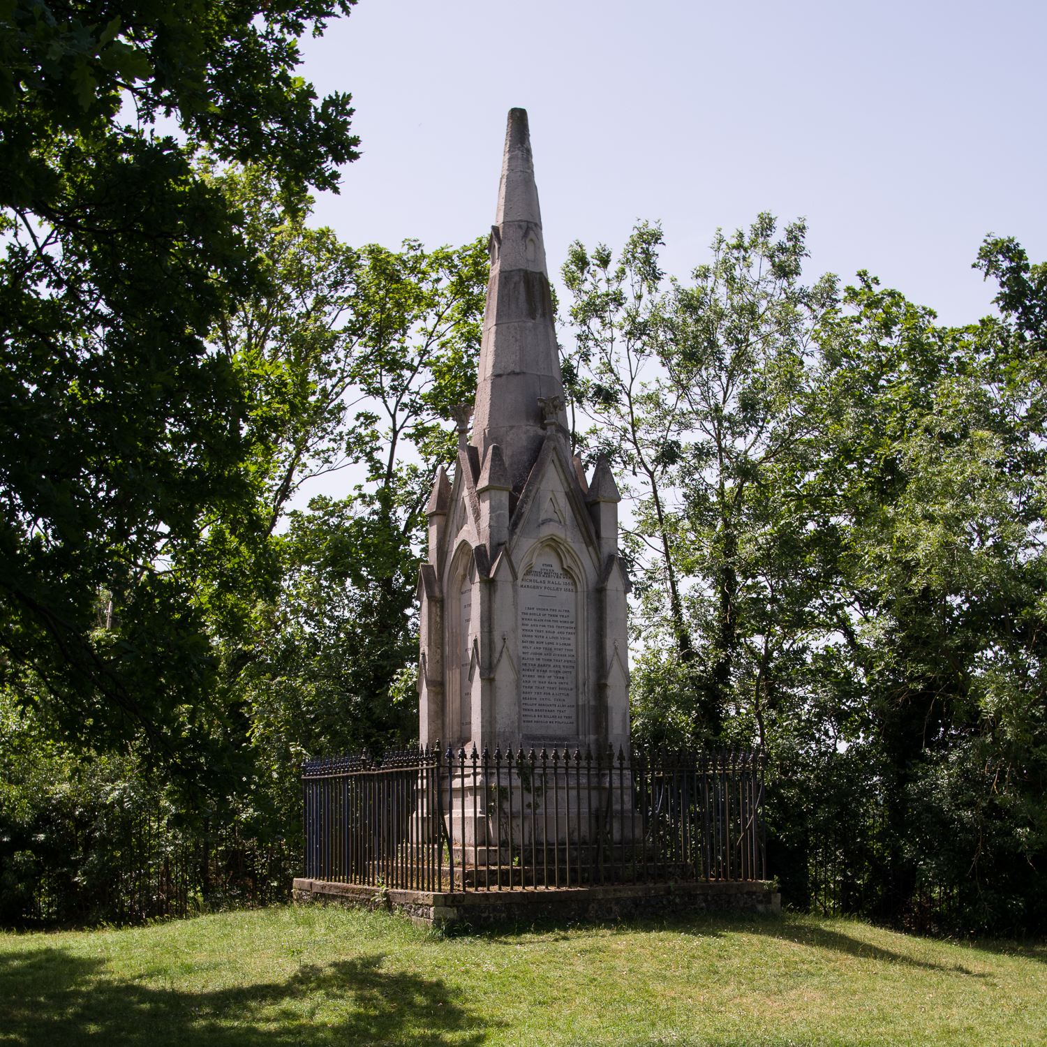
The larger chest tombs have been left in place (Fig. 2). The cemetery also has a monument to the Dartford martyrs (Fig. 3). This monument was built in 1851 in memory of three protestants, Christopher Ward, Nicholas Hall and Margery Pollen, who were burnt at Dartford in 1555. The monument is listed.
Figure 2: chest tomb to John Hall who died in 1836. John Hall was Richard Trevithick’s last employer.Figure 3: monument to the Dartford martyrs built in 1851.
Perhaps the most interesting aspect of this cemetery, however, is that it is the final resting place of Richard Trevithick. Trevithick was a Cornish engineer and inventor. He designed and built a number of high-pressure steam engines. One of those, the Catch-me-who-can ran on a circular track just south of Euston, now identified as being located on the site of the Chadwick building at UCL. Trevithick died a pauper in Dartford in 1833 and was buried here in a pauper’s grave (Fig. 4).
Figure 4: plaque commemorating the burial of Richard Trevithick at Dartford.
So, what has all this to do with geophysics? Apparently, Trevithick’s colleagues who buried him were afraid of body snatchers:
It is interesting to learn of the special steps which were taken in those days to defeat the body snatchers. Thomas Aldous, who was at the works from 1843 to 1879, told the author that his father who was one of Hill’s workmen at the funeral. He described the coffin as being fitted with two long stout pieces of timber placed at right angles to the coffin above and two pieces below: these were strongly bolted together so as to clamp the coffin between them, and as a further precaution the nuts of the bolts were under the bottom timbers so they could not be disturbed from above. It is obvious that to get the body out the who structure must be removed necessitating the excavation of an enormous hole.
Evarard Hesketh (1935). J. and E. Hall Ltd 1785-1935, p.14.
My worry about this story is that it sounds a little at odds with “a pauper’s grave”, although Trevithick died only five years after the infamous case of Burke and Hare which may lend it more credence. If true, however, there should be at least four vertical iron bolts. Iron objects on end have a distinctive signature in magnetometry data. They usually have a strong positive reading as a small point and then a “halo” of negative readings around them. It was a very long shot, but it was worth a day trip to Dartford, so in July last year (2022), Jim, Ruth and I headed to the cemetery to undertake a day’s survey.
The survey took place when we were using the Foerster magnetometer. This meant that we had to lay out a rather complex set of grids and indulge in quite a bit of wheel spinning. This made the survey slow given the head scratching involved, not helped by the many trees which blocked the GPS signal (Figs. 5 and 6).
Figure 5: Ruth, Jim and Kris map out the grids of the survey. Photo: Ken Walton.Figure 6: Jim West using the Foerster magnetometer. Photo: Ken Walton.
We managed to survey three areas: one near the plaque on the wall, one near a second entrance which might be where Trevithick was buried, and a third out of interest due to some parch marks in the grass (Fig. 7).
Figure 7: the three mag areas.
In area one there are a number of ferrous items: two bins on steel bases and an area of fencing along the wall, as well as two paths, one a decorative sinuous path of crazy paving and the other a tarmac path (Fig. 8).
Figure 8: view across area 1 showing the fencing, bins and sinuous path.
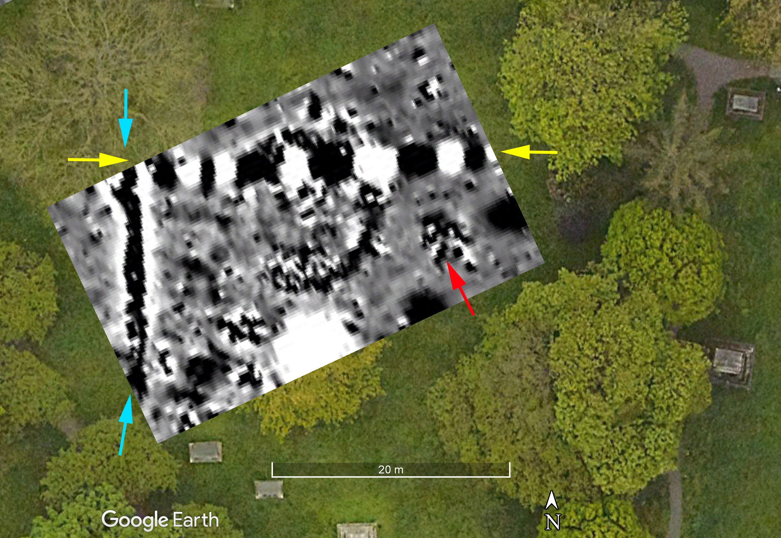
The mag results are shown in Figure 9. For reasons I haven’t managed to sort out, the survey is about 2m further south on the Google Earth image than it should be. As can been seen, the dark line representing the tarmac path in the mag data does not quite line-up with the actual path. I’ve marked the two bins, and the red line represents the railings. Significant areas of the survey are masked by strong ferrous responses like the bin and the fence. There are also some big ferrous objects in the eastern half of the survey. There are, however, some weaker features. I have marked three with yellow arrows. East-west they are 2.5m apart and north-south 1.5m. Are these Trevithick? I think I am grasping at straws but I guess it is possible, although perhaps unlikely.
Figure 9: The mag results from Area 1. The red line presents the iron fence seen in Figure 8.
Area 2 was chosen as it is near the second entrance to the cemetery and some of the sources can be interpreted as saying Trevithick was buried there. The large number of trees made surveying in the grid very difficult, and again the mag is not quite in the right place (Fig. 10). We can see, however, that really the only thing that shows is the iron work on the western edge of the area, and the two paths which cut across it.
Figure 10: the magnetometry results from Area 2.
Area 3 was chosen for different reasons. It lies in a relatively open area of the cemetery, and had some interesting looking parch marks. There had been a chapel but this had largely gone by the 18th century and we are unsure, exactly, where the chapel lies. We were hoping the parch marks might show us the location of the chapel. It was, thankfully, a relatively straightforward block of mag data to collect at the end of our day (Fig. 11).
Figure 11: Mag results from Area 3. See text.
In Figure 11 the linear feature marked with yellow arrows is the classic signature for an iron service pipe, either water or gas probably. The fact it heads directly towards the gate in the eastern wall is not a surprise. The dark line indicated with the light blue arrows looks like other paths we have seen in the park, but this one is clearly completely over-grown. Finally, there is the curious circular feature in the middle of the plot. Aerial photographs in Dartford Museum from 1960 and 1971 show that there was a ornamental feature here. The 1960 photograph also clearly shows the path we have mapped. The 1960 photo shows that the tombstones had been moved by that date and that the park was well-tended with circular flower beds.
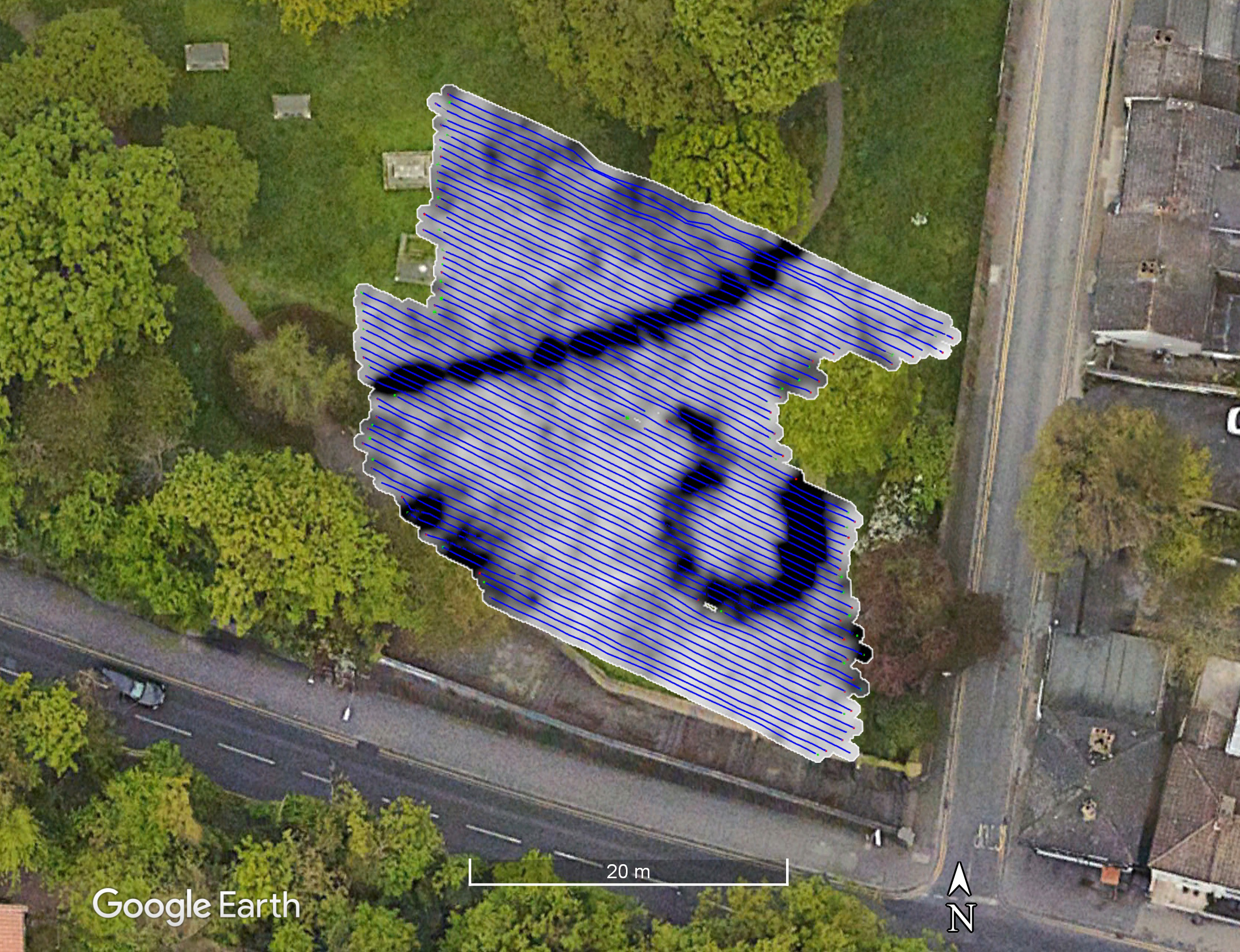
Although the mag results were not very exciting, the prospect of finding the “missing” chapel drew Mike Smith and I back to Dartford in August 2023 with the GPR. The new GPS that is normally on our Sensys magnetometer freed us from having to work in traditional grids, and has fewer problems with the tree cover (Fig. 12).
Figure 12: Kris (wearing the same Welwyn Archaeological Society tee-shirt as in Fig. 5!) pushing the GPR in Area 1 with the new GPS attached.
We surveyed two area: one roughly coincident with Area 1 and a second in the hopes of locating the chapel in Area 2. The advantage of using the dGPS is that it saves on laying out grids, and you get a cool map of where you have been (fig. 13)!
Figure 13: Timeslice 5 (10.5 to 12.5 ns) with the GPS tracks overlaid.
The GPR survey in Area 1 picked-up the tarmac path and the crazy-paving horse-shoe shaped path, but very little else. Figure 14 shows timeslice 5 (10.5 to 12.5ns) and Figure 15 shows slices 2 to 10.
Figure 14: time slice 5 (10.5 to 12.5 ns).Figure 15: Timeslices 2 to 10.
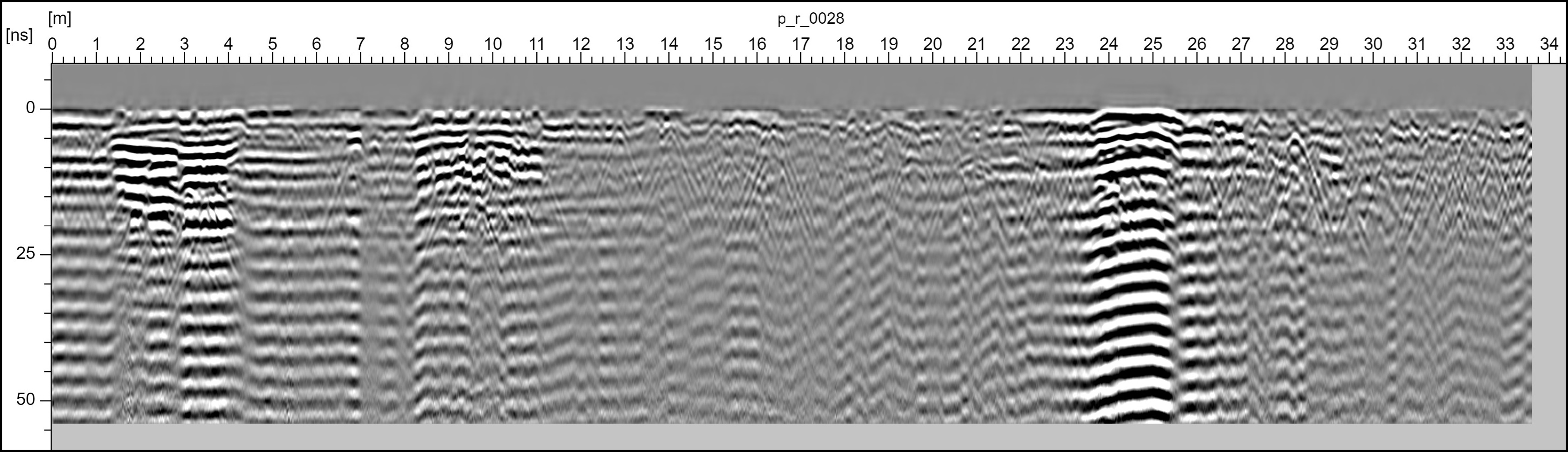
I was very surprised at how little was showing and how persistent the surface features are. I very much doubt that the crazy-paving path was more than a few inches thick, and yet it persists in the slices down through the sequence. Looking at the amplitude profile (aka ‘radargram’) we can see that we are getting very little real depth penetration (only to about 15ns). The horizontal banding that can be seen in Figure 16 is typical of radargrams before they have had a “background removal” routine performed on them. This image, however, is of a radargram after background removal!
Figure 16: Profile 28. The strong flat reflections are the paths.
This suggests we have not got a very deep penetration and almost everything we are seeing is either at the surface or just below. I’m investigating why as conditions should have been OK on this site.
The second survey which overlapped with Area 3 of the mag survey showed some interesting features. Figure 17 shows the third time slice (5.9 to 9.4ns, 0.3-0.5m below surface). The double-circle is the garden feature which shows in the 1960 photograph with a path coming off to the west. This path joins the one shown by the light blue arrows in Figure 11 and can also be seen in the photo. The discontinuous nature of the circle on the northern side is probably because the service shown with yellow arrows in Figure 11 cuts through the circle at this point.
Figure 17: Area 3 GPR survey. Timeslice from 5.9 to 9.4ns, 0.3-0.5m below surface.
Looking slightly deeper there is quite a strong reflection marked in Figure 18 with a yellow arrow. This corresponds to an area of ferrous noise seen in Figure 11 marked with a red arrow.
Figure 18: GPR slice 5 (11.9 to 15.4ns, 0.6 to 0.8m below surface).
This big feature shows clearly in the radargrams (Fig. 19, red arrow).
Figure 19: Profile 107 with the large feature indicated with the red arrow.
Given the size of the feature, its orientation and the complex reflections shown in the profile, I suspect this may be a burial vault which would have lain under a monument like that shown in Figure 2. Compare the size and shape of it to the one which can be seen near to the road in Figure 18. Some of the other “blobs” (technical term that!) may be similar things. There is also a faint hint of the service in Figure 18 as shown by the blue arrows.
Despite our best efforts both Trevithick’s grave and the chapel eluded us. But we had two pleasant days none-the-less. Thanks to Ruth, Jim and Mike for their hard work, and to Ken Walton, Chris Baker and Mike Still for setting this up, to the Dartford District Archaeological Group for hosting us and the Forrester’s pub for letting us use their car park and a nice pint of real ale at the end of the day (Figure 20)! Many thanks also to Dartford Borough Council for allowing us to undertake these surveys. Perhaps next year we could try res…
Regular readers of this blog will know that over the years we have surveyed both within and outside the walls of the Roman “small town” of Durobrivae near Peterborough. Before Christmas we completed the Boat Field just outside the SE gate of the town. Historic England asked if we could survey some transects across three fields south of the A1, just to the west of the town. Figure 1 shows the areas we have surveyed with magnetometry survey.
Figure 1: Areas surveyed by CAGG at Durobrivae.
The sample survey transects are across three fields: Cherry Holt, The Glebe and Glebe Sands (Fig. 2).
Figure 2: The three new survey transects.
The weather was not very pleasant. There was a cold wind blowing in from the east with squalls of rain to add to the delight (Figure 3). We did, however, manage to complete the three transects with time to spare. We completed 4.28ha of mag survey in the two days and had time to take magnetic susceptibility readings over the three transects in the afternoon of the second day. We swapped who was pushing the mag every 30m or so just so that the people holding the poles could warm up!
Figure 3: Ruth pushing the Sensys magnetometry cart towards Jim holding one of our target poles.
The first field we surveyed was Cherry Holt to the west. We completed a 340m x 50m long transect across the field by mid-afternoon. We chose the line of the transect in the hopes of detecting the double-ditched feature that can been seen in the Google Earth image, and has been seen in various Historic England air photos (Fig. 4, norrthern light blue arrow).
Figure 4: Magnetometry survey in Cherry Holt. Arrows explained in main text.
The first thing to notice in the magnetometry results are the east-west stripes and the north-south striations. The east-west stripes (the dark blue arrows indicate just one) are land drains. They show very clearly in the Glebe. The north-south striations are cultivation marks probably from when the field was last ploughed. The most obvious archaeological features are the double ditches indicated by the red arrow. I’ll discuss these in relation to the next transect.
The line of rather ferrous looking responses indicated by the yellow arrows look like an old fence line. To check this I downloaded the 19th century OS maps from Edina. After various failed attempts to get Google Earth into QGIS or the map data into Google Earth, I resorted to quickly digitizing the key features in QGIS and then importing those into Google Earth. Figure 5 shows the result. The red lines are the field boundaries and as you can see, one lines up perfectly with the feature in the mag data (Fig. 6). Hurrah! I have also plotted the “Roman house”, “Roman villa” and “iron works” from the OS map (Fig. 5).
Figure 5: field boundaries (in red), the footpath and archaeological sites from the 19th century OS maps overlain on Google Earth.
Figure 6: Detail of the mag survey in Cherry Holt. Arrows explained in the text.
The rather strange shaped feature in the southern half of the transect (Fig. 4, pink arrow, Fig. 6 red arrow) is hard to interpret. Due to its odd shape I’m guessing it is likely to be natural, but that is just a guess. The blue arrows in Figure 6 show the line of two linear features, maybe early field boundaries? They do not occur on the OS map so are earlier than the first surveys in the 19th century.
One entertaining observation regards the footpath shown in Figure 5. On the northern edge of Cherry Holt is a kissing gate with a bridge across the drainage ditch which runs alongside the A1. Judging by the brambles on the little footbridge I doubt anyone has used it in a while. Besides, one would have to be mad to try and cross the A1 on foot at this point (Fig. 7)!
Figure 7: the kissing gate at the north edge of Cherry Holt.
In Figure 6 I have indicated three linear features with yellow arrows. We had originally thought these might be roadside ditches, but they do not show up at all in the mag data. The survey in the Glebe to the west suggests that at least some of them have a more prosaic origin.
The aerial images of The Glebe (Fig. 4) show lots of features including the corner of the double-ditched feature and an enclosure towards the south. We placed the transect (Fig. 4, red line) to catch these features. Figure 8 shows the results.
Figure 8: mag survey in The Glebe. Coloured arrows explained in the main text.
The red arrows show the corner of the double-ditched enclosure. This feature was partially excavated when the A1 was widened. Stephen Upex is currently working on this legacy excavation and states that it contains Flavian pottery. The enclosure looks rather military even though it doesn’t have the classic “playing card” corner shape.
The field is covered in field drains. The yellow arrows show just one of them. The pink arrows indicate the southerly drain at which point the others run at right angles to it. This land drain lines-up with one of the linears shown with a yellow arrow in Figure 6. This suggests that our “road” might be connected to the drainage instead.
The blue and orange arrows indicate two further complexes of ditches. We have only just clipped the one indicated by the blue arrow but the crop marks suggest there is more to the west. The southern one matches the clear crop marks seen in the Google Earth image (southern light blue arrow in Fig. 4). Although this is near the “Roman villa” marked on the early OS maps, my gut feeling is that this is earlier, possibly late Iron Age. The straight ditch marked by the green arrow might be a boundary ditch for the villa if it lies slightly to the east of our transect.
From our survey and the aerial images, this field appears to be very busy archaeologically!
The final field to the east was Glebe Sands (Fig. 9). The transect went up a slope and then at the north end was a plateau. This can be seen clearly in the lidar image (Figure 10).
Figure 9: Magnetometry survey in Glebe Sands. Red line: old field boundary.
Figure 10: Lidar data for the area.
The flatter plateau marks the edge of the sands and gravels with alluvium downslope to the south. There are quarry pits along the edge of the plateau which is possibly the origin of the fieldname: Glebe Sands. The “iron working sites” marked on the 19th century OS map also lie on the plateau edge. The rather amorphous magnetic features are probably the remains of these quarry pits (Fig. 9). At the southern edge of our transect are some faint traces of field drains running NNW to SSE, one of which is indicated with the white arrow.
The northern end of our transect is very busy with a series of linear features, almost certainly ditches, and two circular features, one 10m in diameter and one 22m in diameter. These may be barrows, but it is curious they are cutting one another. Perhaps one is prehistoric and the other Roman or Saxon? Whatever the precise dating of these features it is clear that the gravel terrace attracted substantial multiperiod settlement.
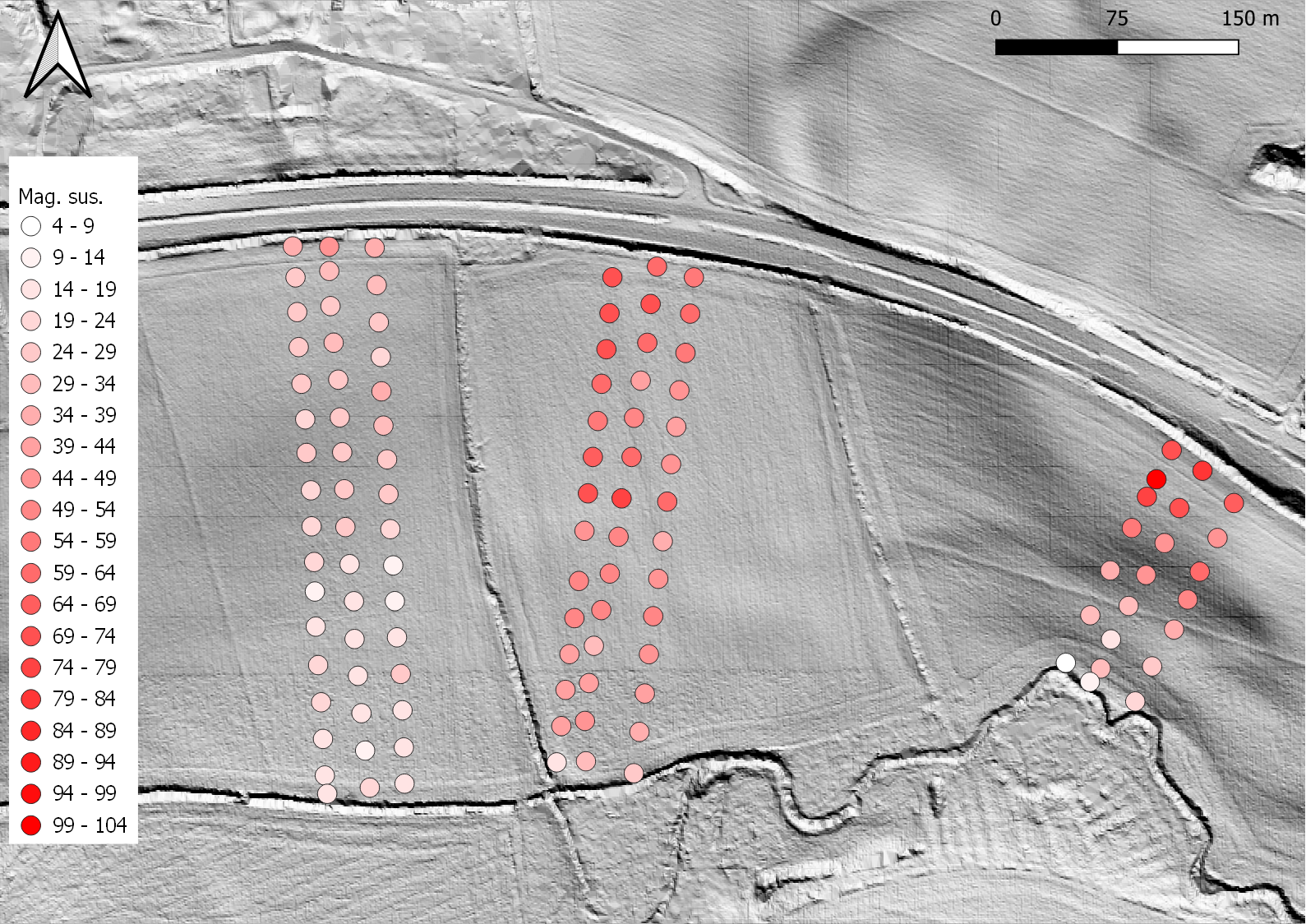
Now that we have our own magnetic susceptibility meter, I am starting to collect some data at any site where we undertake a magnetometry survey. Over time I’m looking to build-up a database of readings compared to geology and our results. Ruth, Jim and I spent the last part of the afternoon collecting readings at roughly 25m intervals. In Figure 11 I have represented the results as shaded circles as the spacing seems too big to interpolate a continuous surface.
Figure 11: the magnetic susceptibility survey results.
The results show some interesting contrasts. Cherry Holt has a more even pattern than the two other fields, and generally low readings. Geologically, according to the British Geological Society’s viewer, the field is split between river gravel terraces 1 and 2. The eagle-eyed of you would have noticed that the plot in Figure 4 is cropped to +/- 3nT whereas the Glebe and Glebe Sands images are cropped to +/- 4nT. Apart from the Roman double ditches at the north end, the features are relatively faint. In The Glebe, the readings at the north end of the field where the corner of the Roman ditches can be seen is high as would be expected where there is dense human occupation. The readings drop, however, as one gets closer to the south and the alluvium. The enclosure to the south of the transect does not show as a particularly high area of readings. In Glebe Sands, the southern area on the alluvium is very low, with the highest readings of all on the river terrace where all the activity is and the “iron workings”.
We have, therefore, two processes at work. The soils which develop on the alluvium have a lower magnetic susceptibility to those which develop on the river terraces, especially terrace 1. The magnetic susceptibility readings are then enhanced by anthropogenic factors where there is evidence of occupation.
Just to finish off, Figure 12 shows Jim with our new Sensys which conveniently has slots for carrying the target poles across the field.
Well, not actually in boats, but in the boat field at Durobrivae. Those of you with long memories may recall that we did some work at Durobrivae in 2016 and 2017 (if you use the drop-down box on the right of this screen you can filter the posts for Durobrivae and see the previous posts.) The aim of the 2016 survey was mainly to test which of the three main survey techniques we had available to us would work on this site. The answer was: all of them! A short article about the results was published in ISAP News (Issue 52, November 2017, pp. 5-9).
We then went back to extend the surveys in December 2017, particularly in the area of the mysterious ‘mound’. Although we got some good data, the mag died (yet again) and not only did we have to stop surveying early, but we lost the grids we had collected that day. Due to the excellent results of what we did manage to survey, Stephen Upex was able to obtain a grant to pay for a towed magnetometry survey of the entire town. In 2019 Stephen teamed-up with Peter Guest (then of Cardiff University) to undertake some trial excavations, including across the temple we had surveyed in 2016.
The field to the SE of the Roman town, just outside the town walls and next to the lay-by off the A1, is Boat Field. Along its northern edge runs the River Nene (with lots of boats moored-up). Ermine Street, the main Roman road from London to York, runs through one corner of the field. Until recently, nothing much showed-up in aerial photographs of this field apart from Ermine Street. The more recent photographs, however, showed that there were indeed features in this field. That isn’t really surprising considering the location just outside the town walls, and the fact that there are several areas of “suburbs” known in and around Durobrivae. Ruth, stalwart member of CAGG, has a long-standing interest in this site and was keen to try our new magnetometer in this field. Given the new machine, the distance from our usual haunts, and the time of year we decided to keep to a small team of just three, myself, Ruth and Jim. The first day of survey was in late September, and we managed four visits in total, finishing the field yesterday before lunch. Completing 6.73ha of mag survey in 3½ relatively short days shows how efficient the new system can be. As we finished Boat Field before lunch yesterday, we did one more grid over the mound so that we could compare the two surveys. Figure 1 shows the 2016, 2017 and 2022 magnetometry surveys.
Figure 1: the 2016, 2017 and 2022 magnetometry surveys.
For the earlier surveys, please see the earlier posts. In this post I am going to concentrate on the new survey in Boat Field, and comparing the old and new magnetometry surveys.
Figure 2 shows the survey of Boat Field.
Figure 2: The Boat Field survey.
As can be seen, there is a great deal going on. The faint stripy-ness in the data is most likely to be old plough scars. The field is covered in a network of ditches with a large number of other features. Figure 3 zooms in on the SE end of the field.
Figure 3: the SE end of Boat Field.
In Figure 3 I have indicated various features with coloured arrows. First of all, the yellow arrow indicates two concentric circles. These are very likely prehistoric, maybe part of a ploughed-out burial mound. The field on the other side of the A1 has quite a few circular features seen in aerial photographs. I have posted Fig. 4 previously, but repost it here.
Figure 4: Oblique aerial photograph of the field to the south of the town showing the Roman suburbs and earlier prehistoric circular features. Photograph courtesy of Stephen Upex.
There are a great many linear magnetic features in Boat Field, most of which are probably ditches. There are two pairs of parallel ditches, running roughly at right angles to each other which might be trackways. These are indicated with blue arrows. As well as the linear features, there are large numbers of “blobby” magnetic features (technical term that…), many of which are quite large. I have indicated one with the green arrow which is over 4m across. Most of these are probably pits although some are quite strongly magnetic. Would they have needed wells so close to the river? A couple of the blobby features are very magnetic and might be pottery kilns. I have indicated these with the red arrows.
Figure 5: the NW end of Boat Field.
Figure 5 shows the NW end of the field. The possible trackways continue as shown by the blue arrows. Ermine Street, the main road from London to York, is indicated with the red arrows. It actually shows less well in the mag data than on the ground where it is a substantial bank. The yellow arrows indicate the line of the ditch outside the town walls. The survey by Durham showed that their was a double ditch to the defenses and we seem to have the outer one here.
There are a number of negative magnetic features which show as lighter lines. Things that are magnetic in the soil have a positive and a negative, a north and south pole if you like. That is why magnetic features have both a dark (positive) and light (negative) elements. The average background level of magnetism is shown in mid grey. Where there is something in the soil which is not magnetic — like a wall foundation made of non-magnetic materials — it will show as a lighter line as the foundations have displaced the slightly magnetic topsoil. In this survey we have some linear “light line” features which might be walls but they cut across the track. They might be land drains leading into the Nene? I have indicated one with a green arrow. There is also a curious circular “light line” feature also marked with a green arrow. Ideally, we should run the GPR or the Earth Resistance meter over those features as those will show foundations more clearly.
Having completed Boat Field before lunch, we decided to re-do the survey over the mound (Figure 6) so that we could compare the Foerster survey with the Sensys. Two things to keep in mind: (a) the Foerster’s odometer was playing up and (b) part of the site has been excavated in 2019. Figure 7 shows the earlier Earth Resistance survey overlain with the contours from a dGPS topographic survey (re-posted from an earlier blog entry), Figure 8 shows the old magnetic survey and Figure 9 the new survey.
Figure 6: The mist shows the location of the “tumulus” beautifully.Figure 7: contours overlain on the Earth Resistance data.Figure 8: The 2017 magnetometer survey.Figure 9: the new 2022 survey.
Thankfully, the old and new surveys look pretty similar! There are, however, a few differences. The most noticeable one is that the building on the southern edge of the mound is much clearer in the new survey than the old one. This may be because of two factors. Firstly, one of the 2019 excavation trenches cut across this building so some of the magnetic overburden will have been removed. Secondly, the odometer problem with the Foerster in 2017 caused a certain amount of stagger error. Look at the strong magnetic linear feature running away from the mound in Fig. 8 and you can see the distinctive “saw tooth” effect caused by this. The second problem is that there is a slight north-south shift in the results. I do not know (yet) if this is my conversion of the GPS coordinates from the original survey (using a website) or some other issue with the new data, but I will investigate!
The new machine (Figure 10), however, is clearly a success. Ruth’s S42 licence lasts for another few months so we are planning to return and undertake some more Earth Resistance and/or GPR surveys. Watch this space!
Regular readers of the blog might have been wondering what is happening this year. I can only apologise that I haven’t been able to write my daily update during the 2022 season. I also have a backlog of other sites to write-up which will get posted when I have the chance. In this post I am going to concentrate on the GPR survey. We have some exciting news on the magnetometry front too which I will save for another day.
Last season (see previous posts for August 2021) we surveyed roughly half of the field to the north of the drive at Gorhambury. This field is called “Blackgrounds” although the team usually call it “the macellum field” after the building excavated there in 1938 by Miss K. M. Richardson. We had completed the magnetometry survey of this field in 2016 (Fig. 1).
Figure 1: Magnetometry survey in Blackgrounds.
The magnetometry survey revealed the course of Watling Street very clearly. Some buildings show extremely clearly, and there are many indications of walls seen in the results as white lines. Remembering that something magnetic has a positive and negative pole (north and south if you like), why do walls show as negative? Mid-grey in these figures represents “neutral”, or the average background value for magnetism. Topsoil and archaeological sediments are often more magnetic than subsoil which is why things like the aqueduct show so clearly. A flint wall is not magnetic, but it occupies a space in the slightly more magnetic surrounding deposits, and therefore shows as a negative reading. If you zoom in to the image you can start picking out many walls, and some make clear rooms and buildings.
Last summer we completed about half of this field using Ground Penetrating Radar (GPR). We use the UCL Institute of Archaeology’s Mala GX with a 450mhz antenna. Many thanks to the IoA for allowing the use of this equipment! We mainly collect data in 40x40m grid squares at 0.5m transect intervals. The radar sends a pulse into the ground roughly every 3cm (Figure 2).
Figure 2: Nigel (NHAS / NCAG / WAS) using the GPR.
The GPR results last summer were really nice, but left us hanging as some really fascinating looking features were starting to show (see “A happy ending”). Well, this year’s survey has not disappointed! Up until now, the survey results have been great but mostly we have found the sorts of things one would expect in the town: roads, small buildings, big buildings, pits, kilns and ditches. This season’s results have had us asking “what is THAT building?” Why? Because they are huge and of unexpected forms. Figure 3 shows all the results up to the end of August 24th.
Figure 3: the GPR results up to the end of 24th August 2022.
Figure 3 shows the Insula XXXVII Building 1 very clearly. This building has been long known and can be seen very clearly as a parch mark on Google Earth. The line of the 1955 ditch — the first century boundary of the town which went out of use, according to Frere, in c.125 — doesn’t show very clearly in the GPR data but is important. Why? Well, the buildings to the NW of the ditch (i.e., outside the early town) all look like the sort of domestic / small business properties one would expect and have seen elsewhere in the town. The buildings to the SE of the ditch, and north of Watling Street, have a very different feel to them.
Figure 4: Block 1.
Figure 4 shows what I am going to call for the purposes of this blog post “block 1”. Here, we seem to have traces of some buildings around an open courtyard. The building in the north-east corner looks well preserved, the others are harder to make out (further data processing might help). The southern edge along Watling Street appears empty of buildings apart from one small on in the SE corner.
Figure 5: Block 2.
Figure 5 shows block 2. I have used an “overlay” analysis to try and improve the visibility of the building. On the NE side of the building we have a range 80m long with a 60m colonnade. It has about 20 columns. To give you a sense of scale, the nave of St Albans Abbey is 85m long. The colonnade looks out over the River Ver which runs to the north. The building seems to be subdivided into many smaller rooms. At either end is a projecting wing, the one on the east end having an apse.
Behind this main range there appears to be a corridor, then an open space, and then another very long building. This one has a central protruding room and two wings, but does not seem to have the multitude of internal rooms of the northern range. Behind this is what might be another courtyard with more rooms in the southern corner.
This building begs many questions. Is it all one phase? Are there connecting rooms or corridors (there are hints)? Do some rooms have floors surviving? Some of these questions can, hopefully, be answered with a programme of detailed data analysis: producing more time slices using different parameters and filters as well as looking at the all-important radargrams.
The biggest question is, however, what is this building? I’ve shown the plan to a few people and no-one has come back to me with an unequivocal answer. The word “palace” has been mentioned by several. If it is a “palace”, to whom does it belong? There are definitely more questions than answers at the moment.
Figure 6: Block 3.
Figure 6 shows block 3. Starting from the NE corner, we have faint hints of a road surface which appears to have gone out of use and been built over. Then there is a large structure, again with an apse. This might be an upmarket house? Behind that is the most curious area. There appears to be a courtyard building with rooms on the inside on the southern side, but rooms on the outside on the northern edge. Aligned SW-NE is an aisled building with quite large foundations. This building is roughly 45m long and 16m wide. It is at a slightly different alignment to the buildings in the next block and appears to cut by then suggesting it is earlier and went out of use. In the courtyard, perhaps attached to the aisled building are two large rooms. Further out into the courtyard, and quite deep in the radargrams, is another building only visible as fragments but with large buttresses.
Figure 7: block 4.
Figure 7 shows block 4 which is bounded on its SW side by Watling Street (Niblett and Thompson Street 14) and on its SE by Street 24. Its NW side is bounded by block 3 discussed above and the NE side faces the River Ver. Starting on the SW side, we can see two, probably, buildings facing onto Watling Street. Then behind them there appears to be a series of buildings within another courtyard. It is quite hard to make out what is inside and what is outside, but it certainly appears as a coherent, and almost symmetrical arrangement of rooms and buildings with that area. In the NE corner, just outside “courtyard” is a large single room building some 10m by 13.5m in size. Projecting from this at an odd angle is another feature, maybe a drain? Street 24 is an important road as it heads to the so-called “theatre gate” and there is some evidence of the road crossing the Ver at this point and going into the field opposite, but that is the topic for another blog post.
At the bottom of Figure 7 there is another building on the other side of Street 24. This building is the “macellum” excavated in 1938 which I will discuss in another post.
Surveying at Verulamium has always been very satisfying, and we have got some excellent results since the first season in 2013. The latest results will, however, generate a lot of discussion as to what these buildings are, and what they tell us about this fascinating Roman city.
Many thanks to the team for all their work this year especially Ruth, Pauline, Rhian, Jim, Mike, Nigel, Graeme and John. More updates soon!
The Leighton Buzzard and District Archaeological and Historical Society (LBDAHS) having been trying to locate the “Holy Well” at Linslade since 2018. The well was very popular in the medieval period, especially in the 13th century. The waters reputedly had healing properties. The well is marked on old maps such as the first edition OS map, but the accuracy of the location is uncertain. The Society have managed to locate a small cottage of 18th or early 19th century date on the banks of the canal which they have partially excavated (Figure 1). In 1915 local historian J. G. Gurney mentioned an old cottage and garden that lay “on the exact site of the Holy Well”, and included a sketch map. This is certainly the cottage which is being excavated.
Figure 1: the post-medieval cottage excavation.
As well as a variety of post-medieval finds, some of the features have included some sherds of medieval pottery of the right date, and one trench a little to the north of the cottage contained a Romano-British pottery sherd.
From a geophysics point of view the site is quite difficult. The main area of interest is the strip along the edge of the canal which has thick riverside vegetation. The excavation trenches regularly fill with water. The site is, however, on the edge of a steep slope down the canal and so gets drier quite quickly as one moves upslope. What were we hoping to find? One suggestion was that because the well was so popular there might be some form of path or track to the well. If we could detect that, perhaps this would give a clue as to its location.
Pauline, stalwart member of both LBDAHS and CAGG, arranged for us to undertake an exploratory Earth Resistance survey at the site. Due to covid and other commitments this took a bit of time to organise, but finally we managed to earmark a couple of days on site (Fig. 2).
Figure 2: the Earth Resistance survey underway.
The survey was somewhat jinxed! On the first day, we couldn’t get a reading at all to begin with. I spent quite some time checking the cables and connections and generally making sure all seemed OK to no avail. In desperation I reset the machine to its “factory” defaults and hey presto, all started to work again. Then, as we were working, one of the welds on the frame broke. Luckily we could keep on working by holding the frame on the sides, and the next day a temporary repair was effected by the liberal use of duck tape. On the second morning I found that we had dropped a bracket from the GPS the day before when packing-up. Thankfully, using the GPS to locate where we packed-up and some careful searching around that point, we managed to find it again. Phew.
On the first day, Pauline, Rhian, Kate and I surveyed a line of grid squares parallel to the canal. Partly due to the vegetation we did not get too close to the canal. Also, the waterlogging would result in featureless results and so it simply was not worth the effort (Fig. 3).
Figure 3: Rhian using the Geoscan RM85 Earth Resistance meter.
On the second day we surveyed a block of grids closer to the current road to see if we could pick-up any buildings in that area. As we usually do, we used the 1+2 method. The RM85’s built-in multiplexer (basically a fancy switching box) means that we collect three readings with each movement of the frame. The first reading has a 1m probe separation and the second two have a 0.5m separation. The 1m separation looks about a meter or so into the ground and the 0.5m separation roughly 0.5–0.7m into the ground. The deeper survey, however, has half the resolution of the shallower survey (1m transect spacing and a 0.5, sample spacing compared to a 0.5m transect spacing and a 0.5m sample spacing).
Figure 4 shows the results of the shallower survey, and Figure 5 the deeper survey.
Figure 4: the 0.5m probe spacing Earth Resistance survey. Black is high resistance.Figure 5: the 1m probe separation Earth Resistance survey.
Looking at Figure 5 first, I would argue that most of what we can see here is geology rather than archaeology. The ground slopes from the bottom of the image to the canal at the top. We can see in the strip of survey at the top of image a band of low resistance readings parallel with the canal. This is almost certainly the transition from the more solid bedrock to river/canal-side deposits and the presence of water. In the area near the road, the high resistance areas near the building are again related to topography rather than archaeology.
The 0.5m probe separation survey in Figure 4 has a few potential features. I have labelled these in Figure 6.
Figure 6: the 0.5m survey labelled.
There is a faint higher resistance line running towards the excavated area on the canalside. This could be a path?
A small rectangular high resistance feature might be the foundation for something.
The blue lines indicate two low-resistance linear features. These might be some sort of cut feature (pipeline, robbed wall lines?).
A high resistance vaguely linear feature.
I wish I could be much more positive with these results and I am the first to admit that none of them are 100% convincing. It might be worth “ground truthing” my tentative interpretations a little more.
Lastly, a thank you to Mike who has subsequently rewelded the frame, and to Jim for making-up some new jump leads ready for the res meter’s next outing.
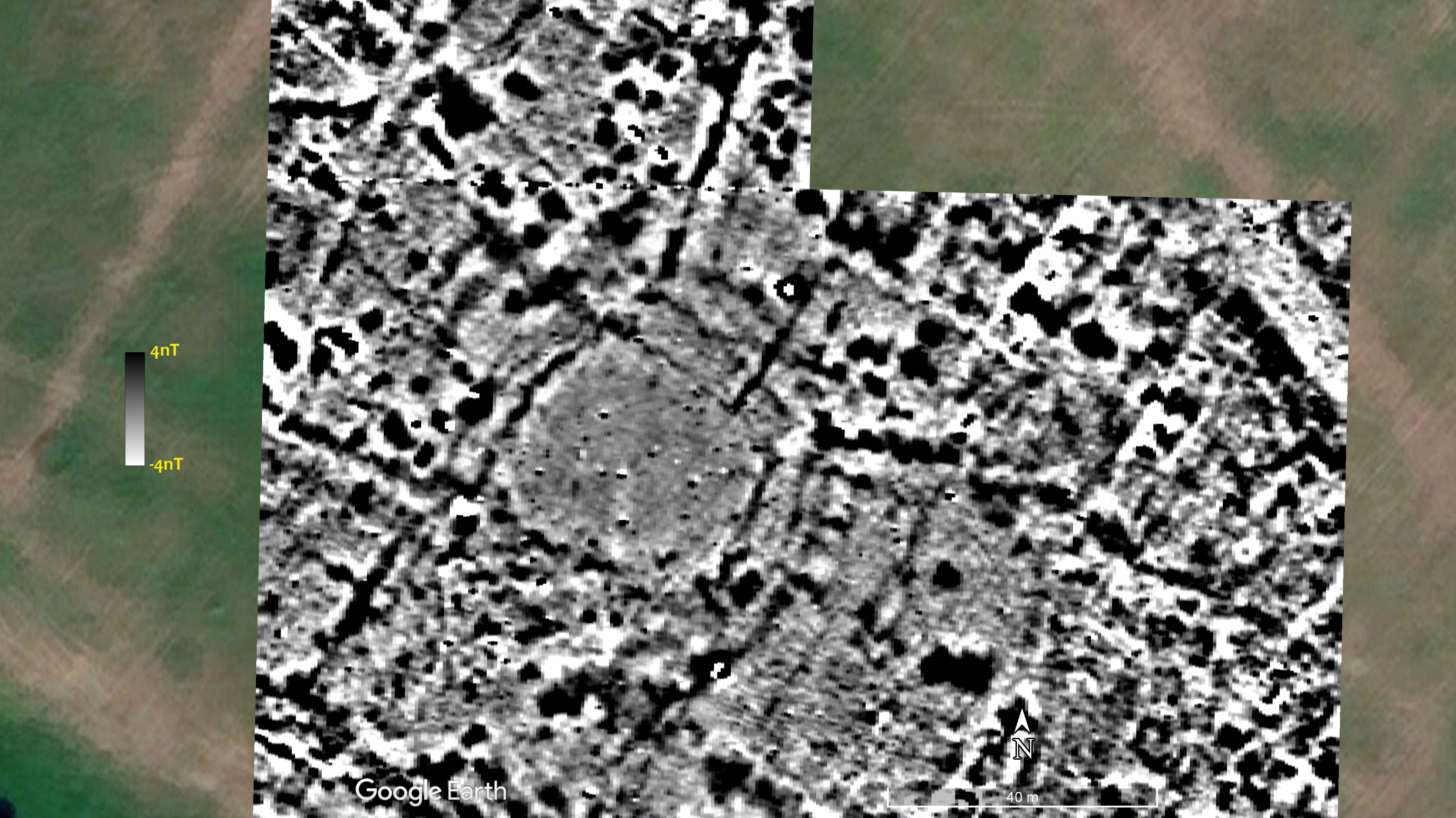
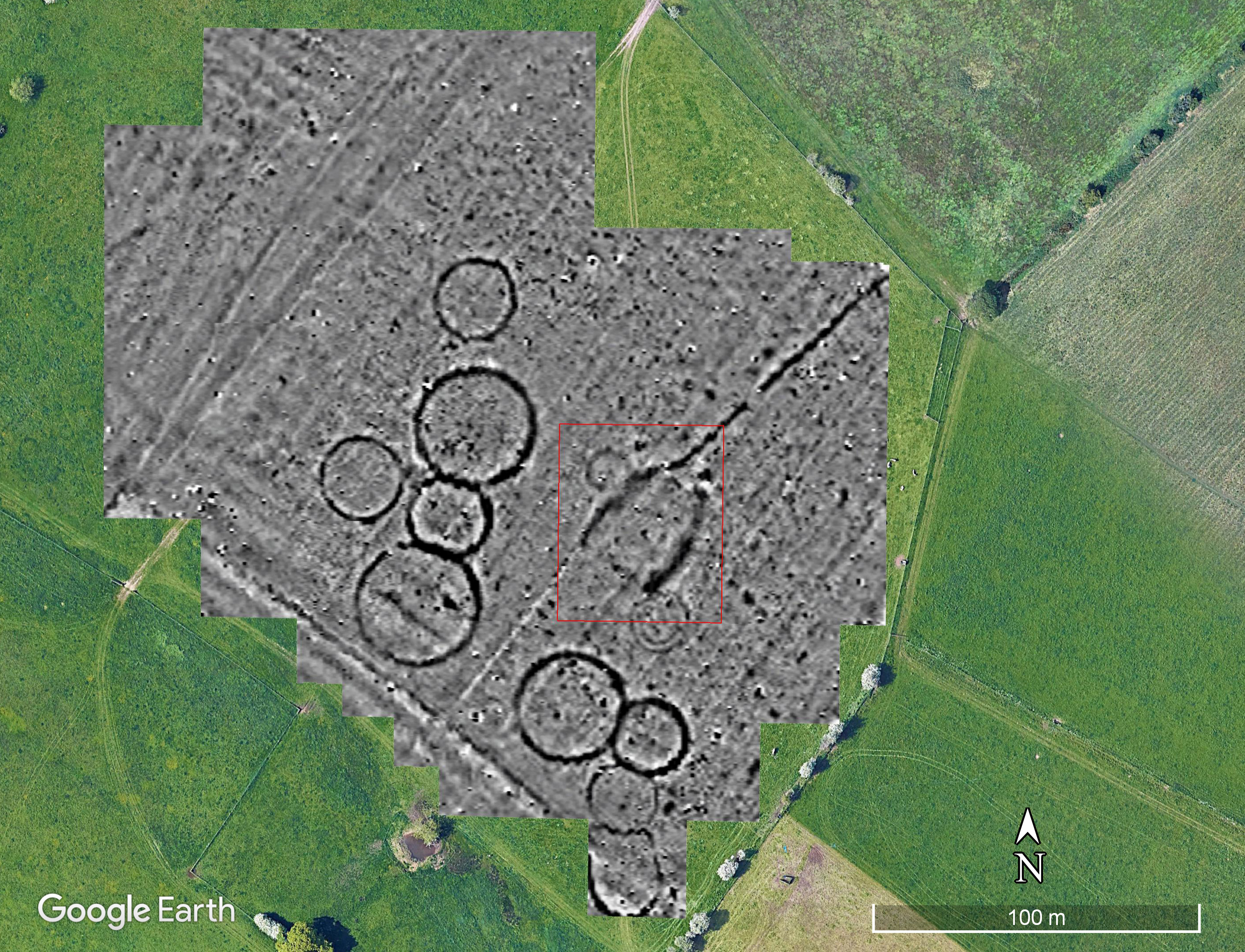
I was asked by a long time friend and colleague, David Griffiths, if we would be interested in undertaking a GPR survey at a site near Kidlington. David, along with colleagues and students from the Oxford University Department for Continuing Education (Twitter: @OxfordContEd), had undertaken some survey work at this site over the last year. Aerial photographs had hinted at the existence of a ploughed-out round barrow cemetery at the site. The 1945 imagery available via Google Earth shows some of these barrows (Figure 1).
Figure 1: The 1945 RAF imagery of the barrow cemetery.
The team from Oxford have undertaken three sessions of magnetometry using Bartington Grad-601s and the results have been very good (Fig. 2).
Figure 2: the gradiometer survey results.
As can be seen, there are 10 ploughed-out probable round-barrows, as well as some linear features including a very clear one running SW-NE with a break in it. An unexpected and quite exciting find, however, is in the red-box in Figure 2 consisting of two curved magnetic features running roughly parallel to each-other. The most likely explanation is that these are the ‘quarry ditches’ either side of a long barrow. The aim of the GPR survey was to see if we could add any detail to this feature. Ruth and I spent two days collecting data ably helped by Stewart and Louise, two of the students (Figure 3).
Figure 3: Kris and Ruth with the GPR (photo David Griffiths).
Following advice from Jarrod Burks, we decided to collect data at a transect interval of 25cm, and to make sure we covered the whole of the long barrow we had transects 50m long. We managed to cover an area 50m by 60m, which is just over 12km of radargrams. There were plentiful cow pats (Figure 4), some of which had baked into concrete!
Figure 4: cow pat blues.
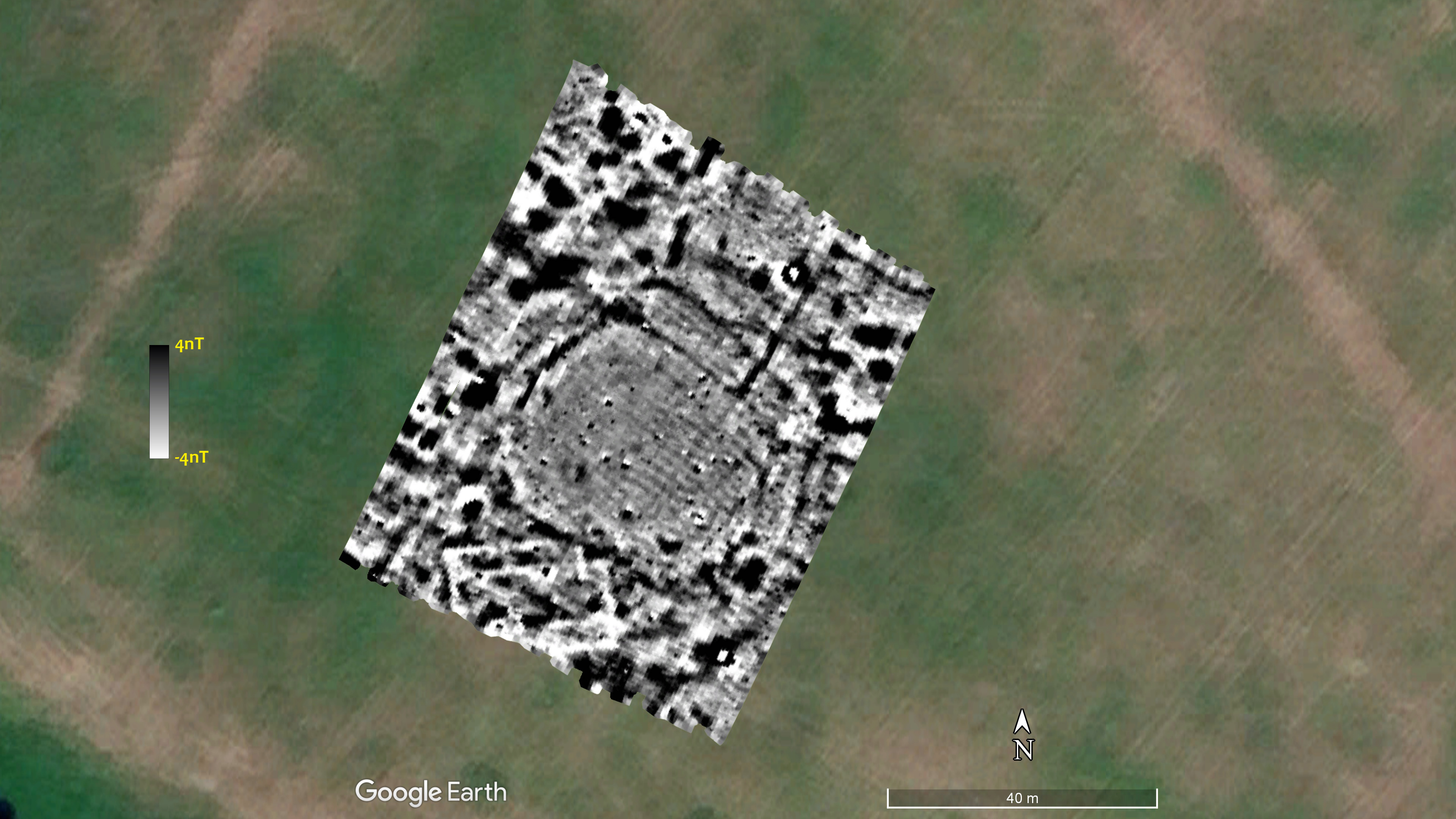
After the first day, I processed the data for a block 30x50m and was singularly unimpressed. We kept going however on the Sunday to cover the whole of the long barrow. I was very puzzled as to why the radargrams on the screen of the GPR looked so promising, and the time-slices were so poor. I processed the whole data set today and realised that something odd was going-on with the data processing. After a bit of trial and error I managed to work something out and, much to my (and everyone else’s) delight, found that the results were really rather good. Figure 5 shows 11 time-slices (aka amplitude maps to give them their proper name).
Figure 5: Time slices from the survey.
Ignore the depths in Figure 5, I have yet to determine the velocity so that I can calculate the depths. The ditches of the long barrow and the round barrows can be clearly seen, however, in slices 5 and 6. Let us look at some of them more closely.
Figure 6: Time slice 1.
In the first time slice (Figure 6) we can see the track which runs across the middle of the area clearly (red arrows), and it matches the Google Earth image perfectly. Having access to a high-accuracy GPS makes our work so much easier! The white line seen in the mag data also shows in the GPR (blue arrow) and are probably land drainage. The oddest thing is the difference between the area at the north of the plot (as shown by the yellow arrows) and below. As we are dealing with the very top surface here, my guess is maybe the farmer used an electric fence at some point and had cattle in the north half but not in the southern?
Figure 7: Time slice 2.
The second slice (Figure 7) shows a series of parallel lines. These are almost certainly land drainage.
Figure 8: Time slice 3.
In slice 3 we can see some ‘strong reflectors’ in the middle, and the hints of the two ditches of the long barrow. The strong reflectors might be the remains of the mound of the barrow. The red line shows something cutting across the feature, which is suspiciously in-line with more modern track marks. Looking at the Google Earth image without the geophysics, however, shows the track curving and joining the N-S one noted above. It seems likely, therefore, that this is a ditch cutting across the barrow.
Figure 9: Time slice 4.
Figure 9 shows the fourth time slice. We can now clearly see the quarries either side of the long barrow (blue arrows), and the ditches from the two round barrows (red arrows). The southern barrow appears to be much less round than usual.
Figure 10: Time slice 5.
Figure 10 shows the next time slice down. The barrows can be clearly seen. In addition, the ditch coming into the grid from the NE shows well (red arrow). There appears to be another feature (possibly a ditch?) that does not show on the mag survey (as indicated by the blue arrows). There are also some long, thin, sinuous features which I do not understand as shown by the yellow arrows.
Figure 11: Time slice 6.
Time slice 6 (Fig. 11) shows the quarries for the long barrow very clearly, along with the various other features discussed above. The red arrow, however, suggests that the southern quarry is not uniform but has split into two.
Figure 12: Time slice 7.
Time slice 7 shows the various features discussed above. We can see, however, the strange network of thin features in the data which I have indicated a few with the yellow arrows. Suggestions on a postcard please…
Figure 13: Time slice 11.
Skipping now to the last time slice, No. 11 (Fig. 13). The round barrows are not visible, but vague hints of the long barrow quarries survive (red arrows). I should, perhaps, have opened the time-window up a little. The linear feature at the top of the grid is still showing very clearly, and some of the mysterious thin features can just be seen.
There is more to do looking at the radargrams and consulting colleagues about what all this might mean, but the main story is fairly clear. As I dislike ending on 13, the next figure is a “view from the office.” Many thanks to David and his team from the Oxford University Department for Continuing Education for inviting us down and getting us involved in this lovely site.